
Disrupting the Borg is expensive and time consuming!

Google Search
-
Recent Posts
- On The Road Again
- Vandalism At The Reflecting Pool
- Fifty Years Ago Today
- Truth Or Consequences
- US Climate Trend Maps
- Declining Spring Snow Cover In Northern New Mexico
- You Can’t Fool Mother Nature
- Cattle And The Climate
- One Atomic Bomb Per Hour
- New Video : Analyzing Oil And Gas
- Is Antarctica Melting?
- High Speed Analysis And Visualization
- El Nino To The Rescue?
- Fake News Update
- Growth Of Antarctic Sea Ice
- 65 Years Of Progress!
- El Nino To The Rescue?
- Worst March Drought On Record
- ChartGL Process Control Demo
- The Biggest Money Laundering Scam
- Drought In The Headwaters Of Lake Powell
- Unrealistic Expectations Of Water Availability
- Did Bill Gates Do This?
- Worst March Drought On Record In The US
- The Real Hockey Stick Graph
Recent Comments
- Bob G on On The Road Again
- Bob G on On The Road Again
- Luigi on On The Road Again
- arn on On The Road Again
- Bob G on On The Road Again
- Bob G on On The Road Again
- Bob G on On The Road Again
- Gordon Vigurs on On The Road Again
- Bob G on On The Road Again
- Bob G on On The Road Again
Quixeramobim, Brazil Had A Cooling Trend From 1896 To 2019
Hi, everyone.
Here is an animation chart for mean annual temperatures in Quixeramobim, Brazil.

As you can see, GHCN V3 Unadjusted data show Quixeramobim had a cooling trend since 1896, while V4 Unadjusted data show a warming trend.
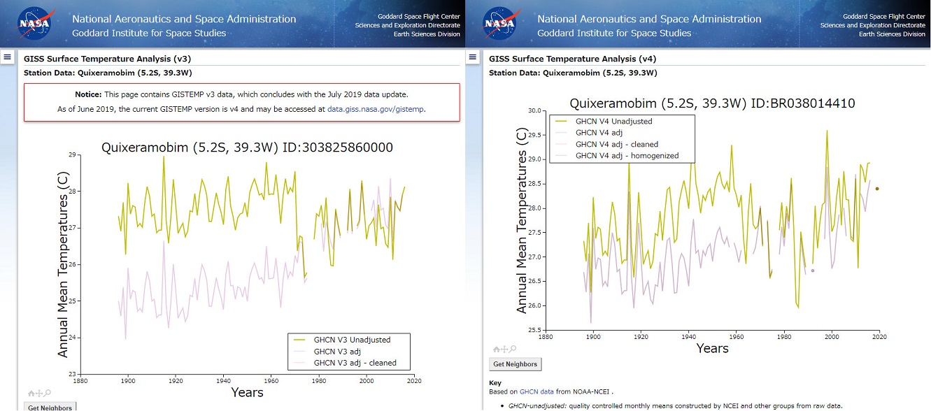
According to NASA, both are unadjusted data, but they aren’t in agreement.
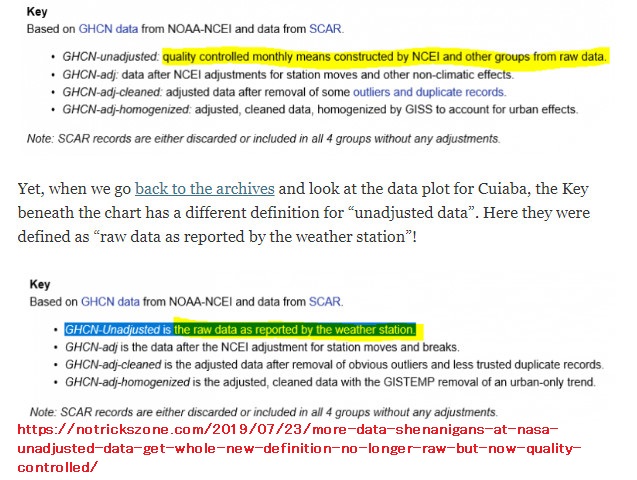
To make matters worse, as I tweeted July 21 2019, NASA used to claim that GHCN-Unadjusted is the raw data as reported by the weather station, but now they changed their explanatory text.
Once you see the post, you can easily see what I mean right away.
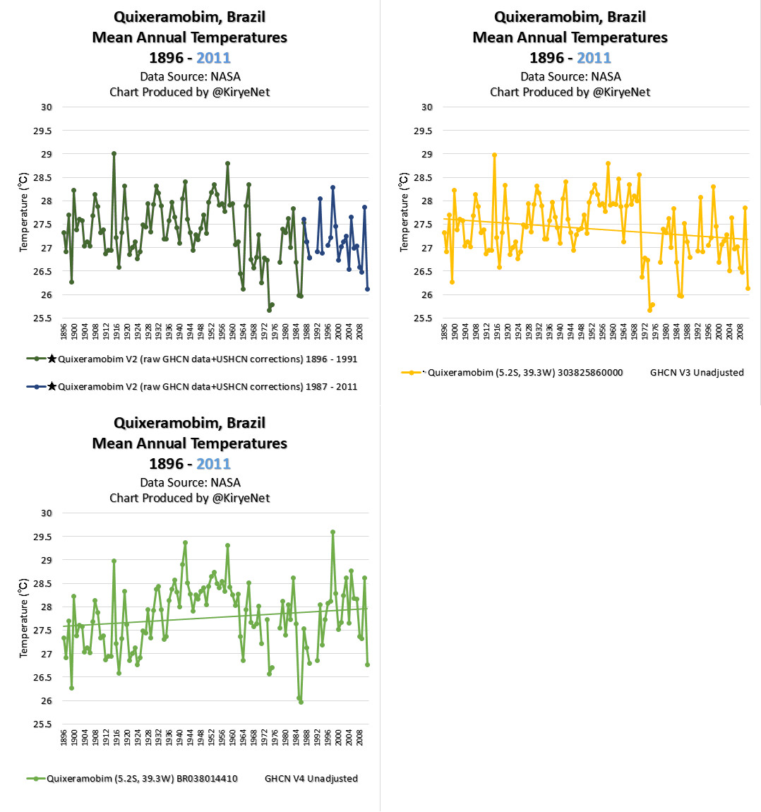
Then, let’s look at the GHCN V2 data set.

?Data Source: (1896 – 1991), (1987 – 2011)
As you know, NASA simply like changing their temperature data.
Posted in Uncategorized
Leave a comment