Labor Day 1935 : Most Intense US Hurricane

On Labor Day, 1935 the Florida Keys were hit by a category 5 hurricane with 185 MPH winds. The winds were so strong, it blew a train thirty feet off the tracks. It was the most intense hurricane in US history.

06 Sep 1935, Page 1 – The Express at Newspapers.com

This came a few weeks after the worst dust storm and most intense rainfall on record.

On May 31, 1935 Woodward Ranch, Texas set the world record with 22 inches of rain in less than three hours.

Colorado got nearly that much rain a few hours earlier.

Extreme Weather: A Guide & Record Book – Christopher C. Burt – Google Books

Imagine the hysteria if we had a repeat of 1935 now.

Posted in Uncategorized | Leave a comment

Charging Your Fossil Fuel Free Electric Car

Posted in Uncategorized | Leave a comment

Arctic Melt Season Crashes And Burns

Tough times for climate alarmists. Arctic sea ice extent is increasing several weeks earlier than normal.

Ocean and Ice Services | Danmarks Meteorologiske Institut

Index of /DATASETS/NOAA/G02135/north/daily/images/2018/

But have no fear!  The press will continue to lie about the Arctic for as long as they can get away with it..

Posted in Uncategorized | Leave a comment

New Video : Climate Fraud At The New York Times

Posted in Uncategorized | Leave a comment

New York Times Fraud At Mt. Vernon, Illinois

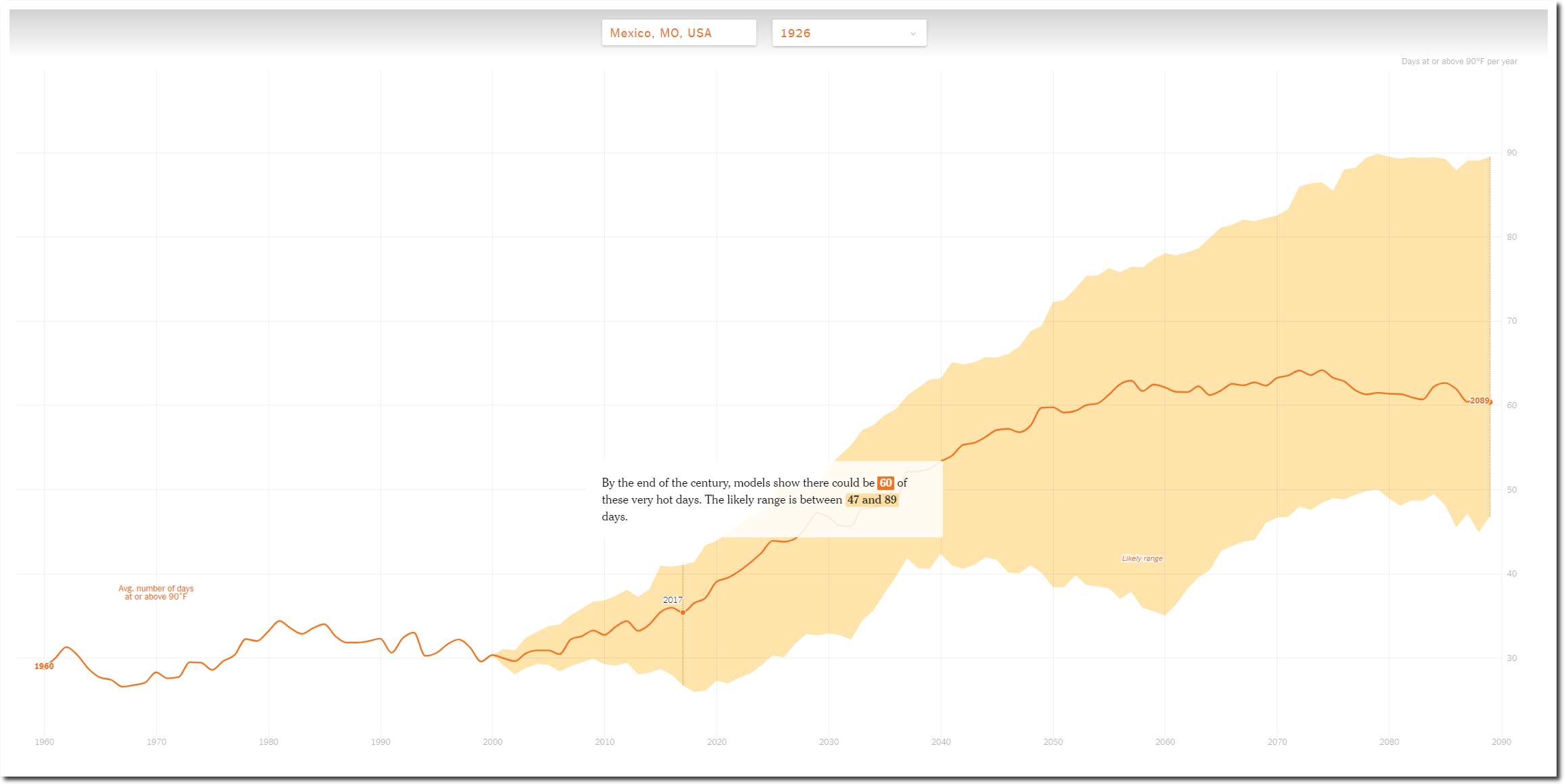
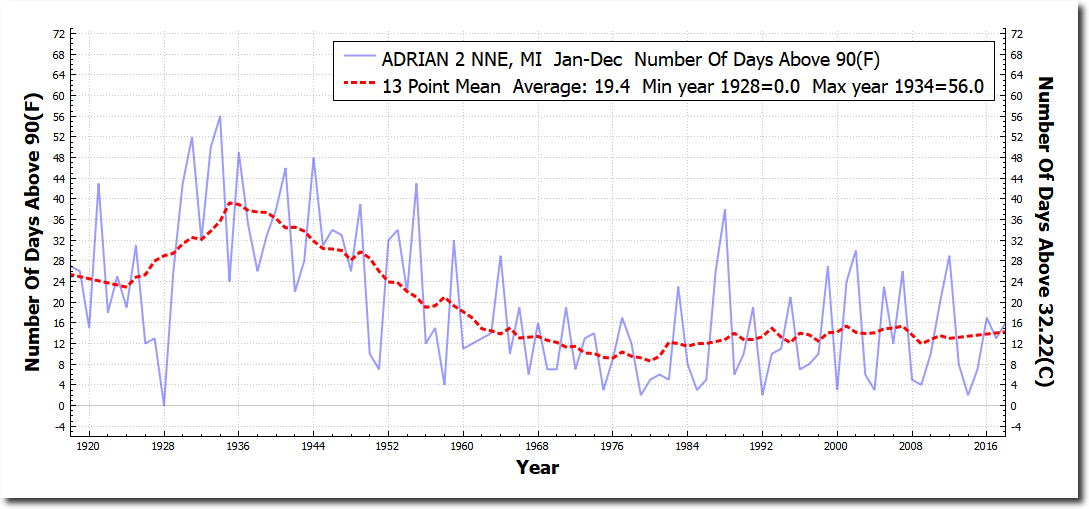
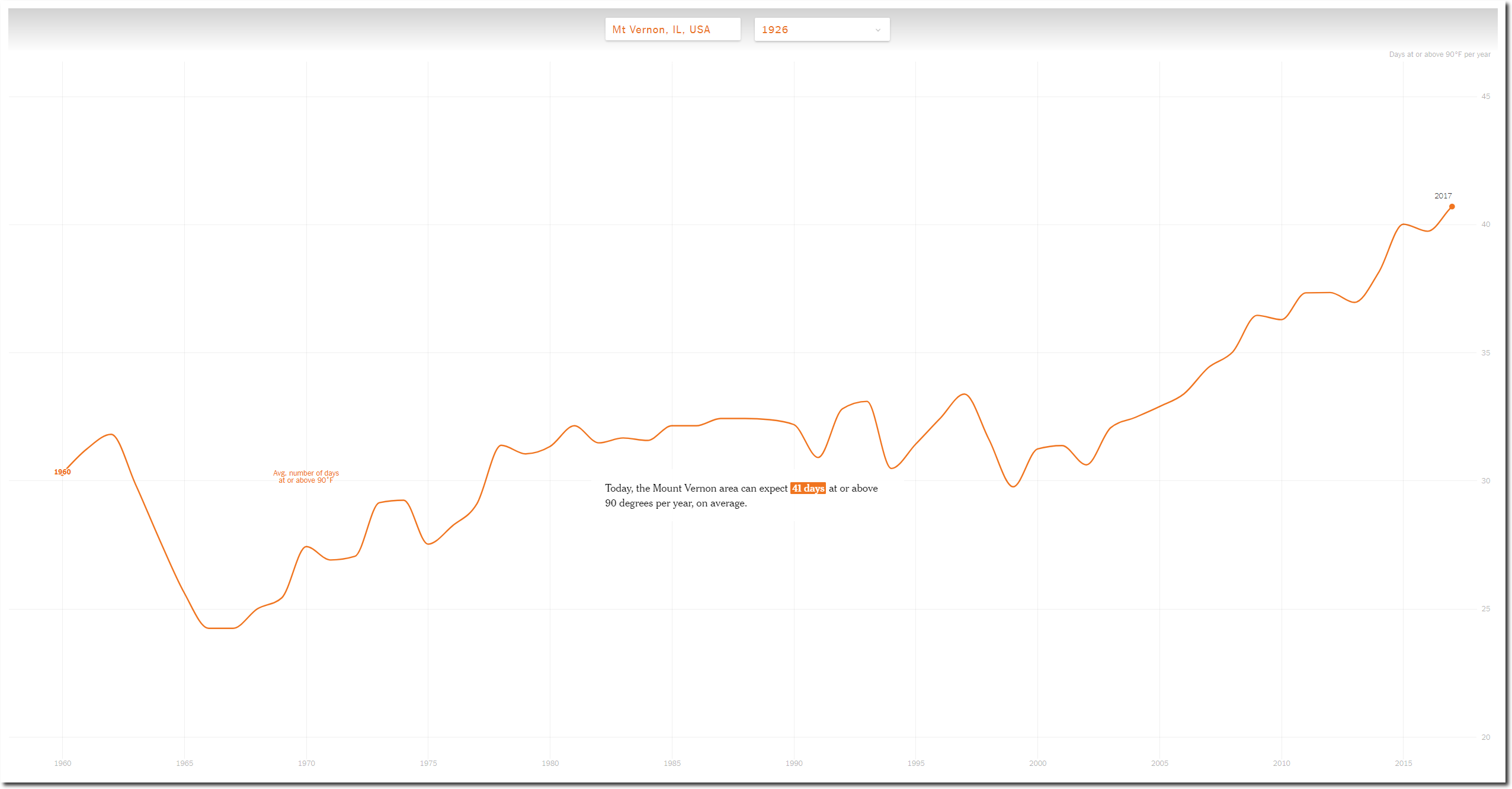
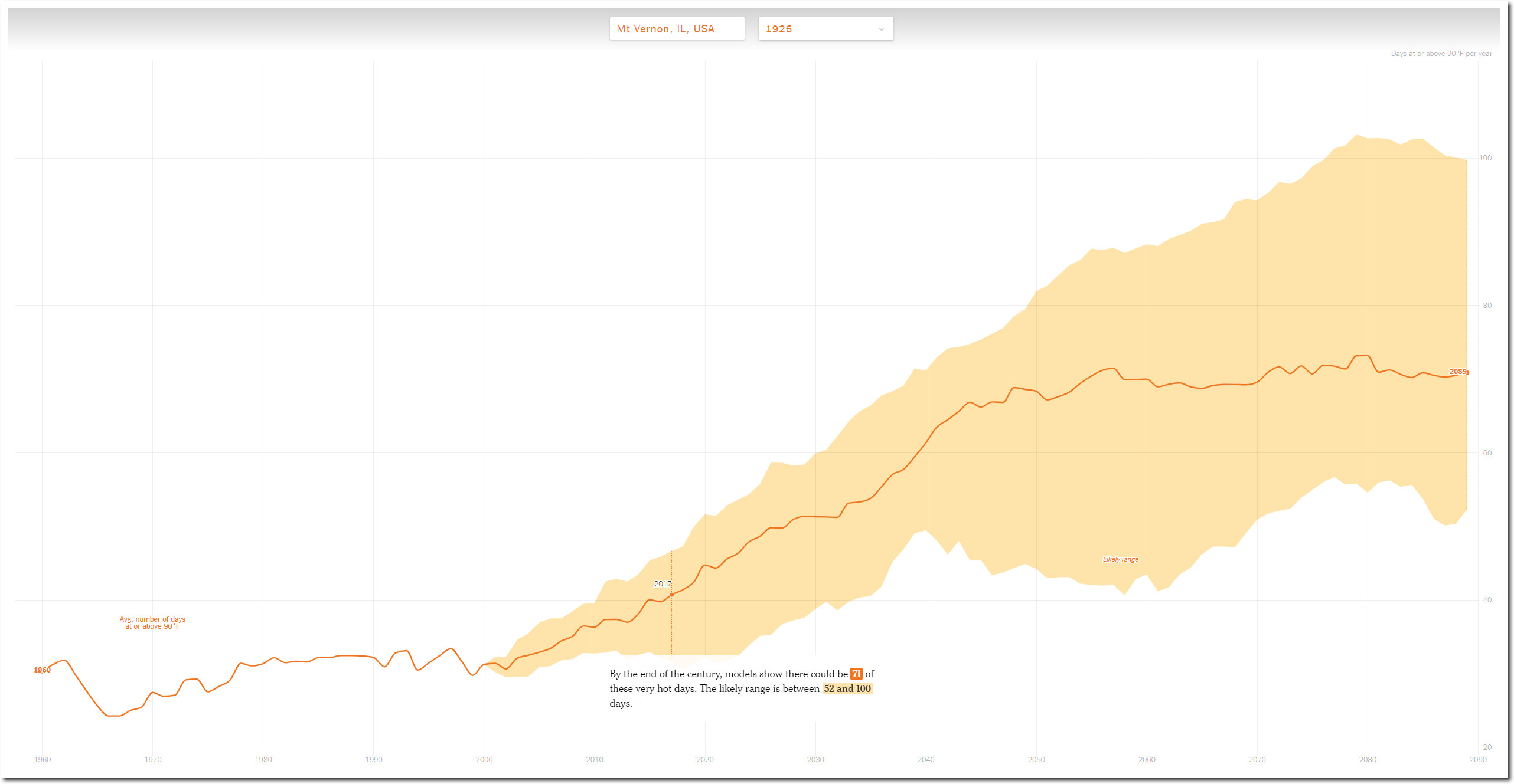
The New York Times claims that the number of 90 degree days at Mt. Vernon Illinois has increased from thirty days per year in 1960, to forty-one days per year now.

How Much Hotter Is Your Hometown Than When You Were Born? – The New York Times

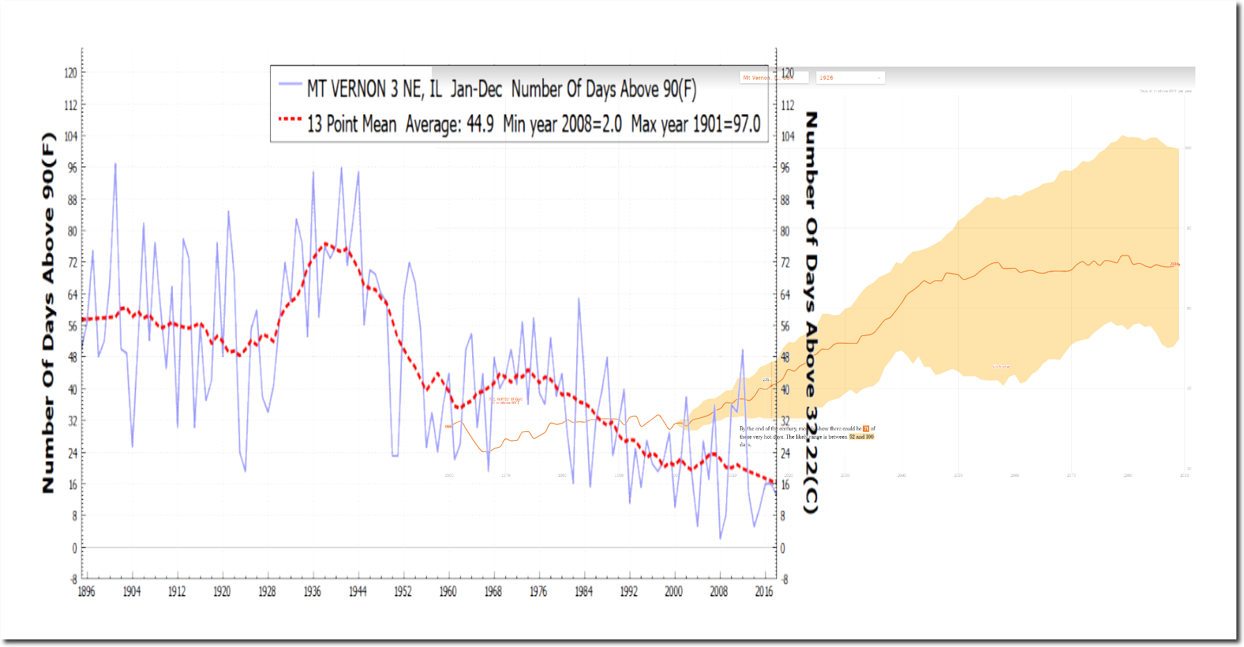
This claim is completely fraudulent. According to NOAA temperature data, the number of 90 degree days at Mt. Vernon has actually declined from thirty-two days per year in 1960 to sixteen days per year now.

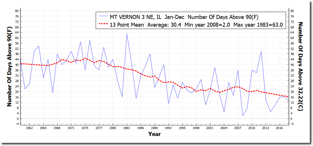
Mt. Vernon has had thirteen days above 90 degrees this year – less than one third of the New York Times claim.

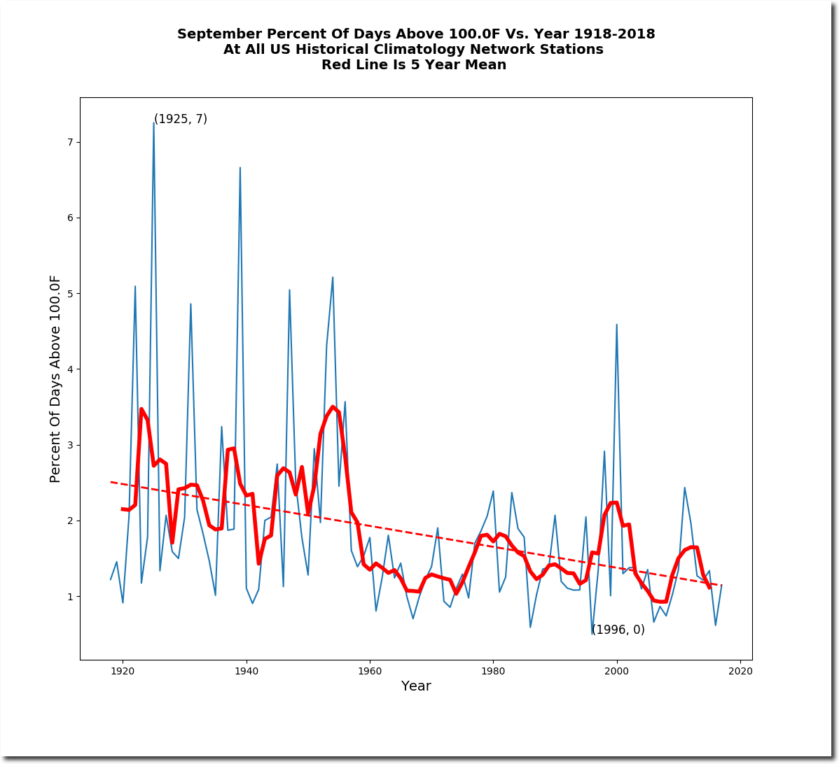
Since the 1930’s, the number of ninety degree days is down more than seventy-five percent.

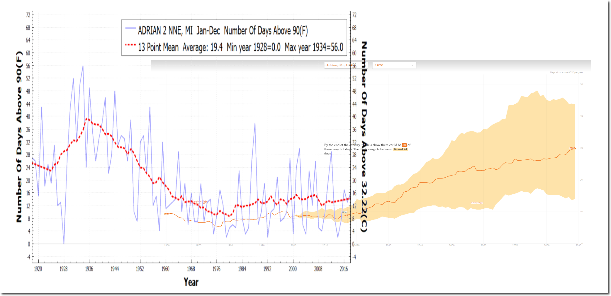
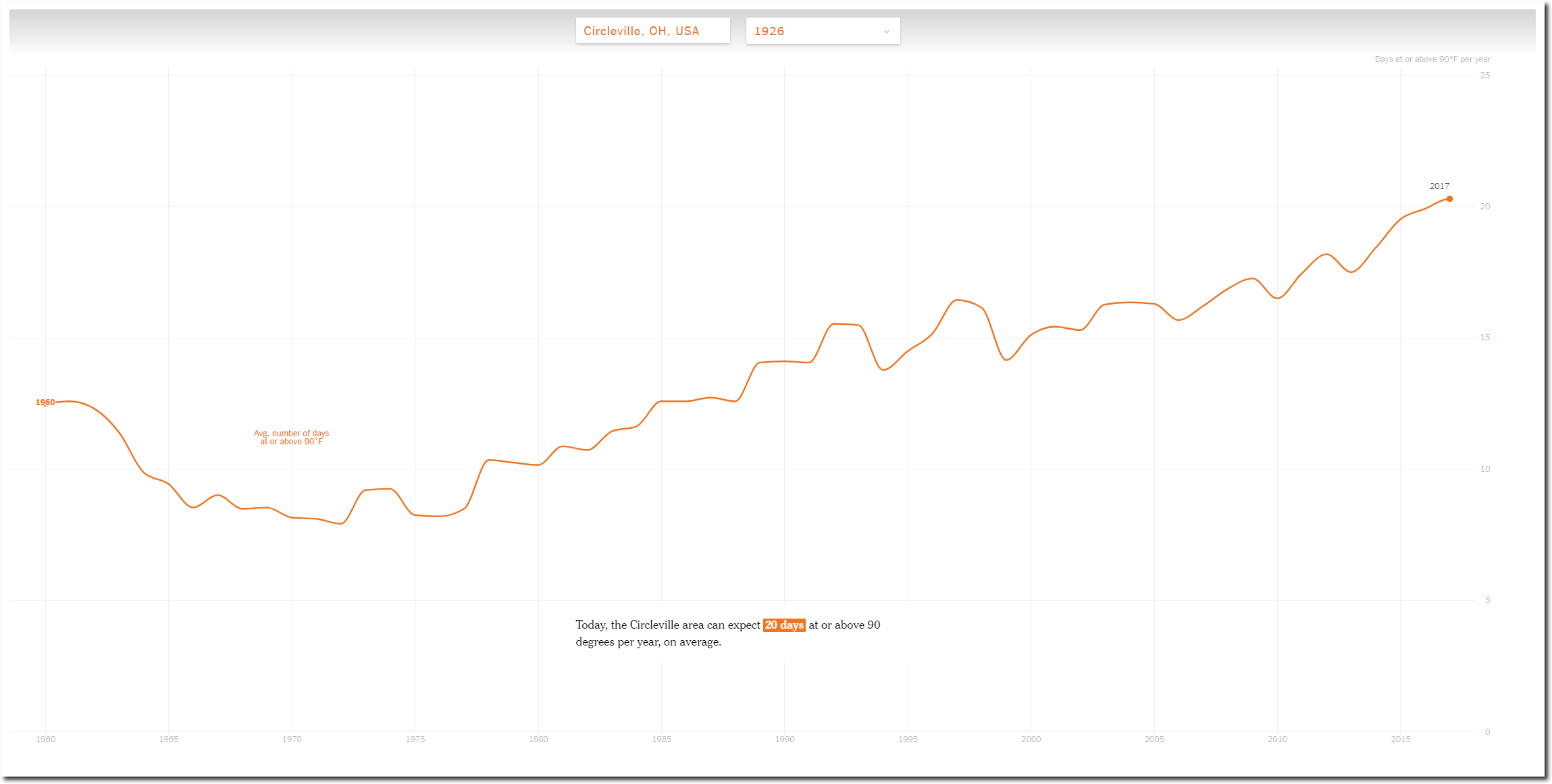
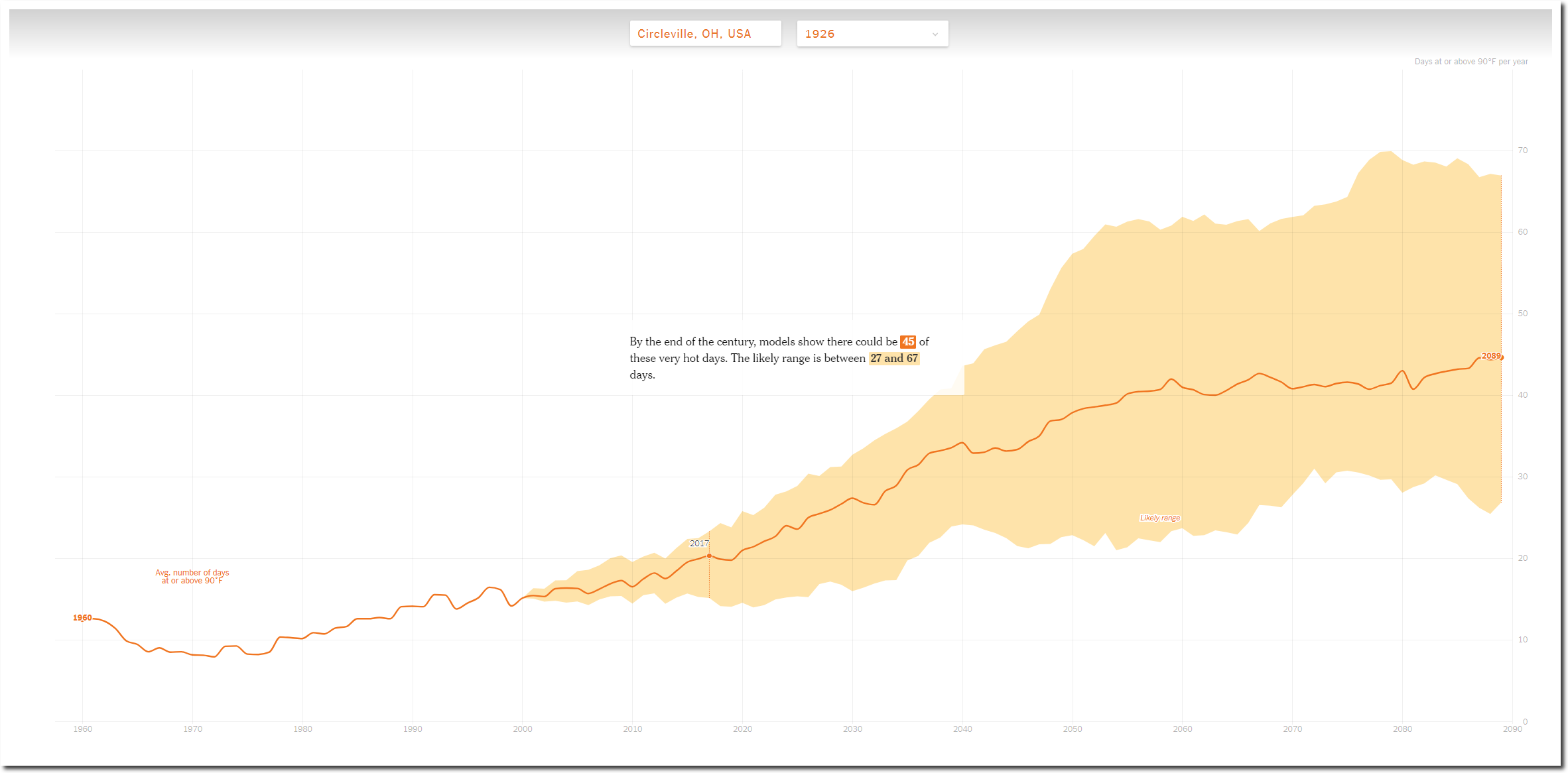
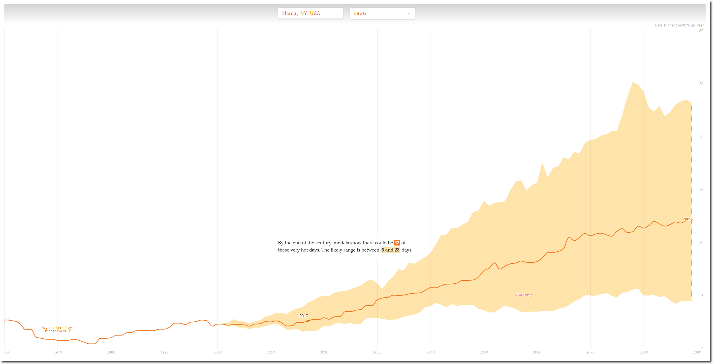
The New York Times projects a large increase in the number of ninety degree days as CO2 increases, when in fact the trend shows the exact opposite.

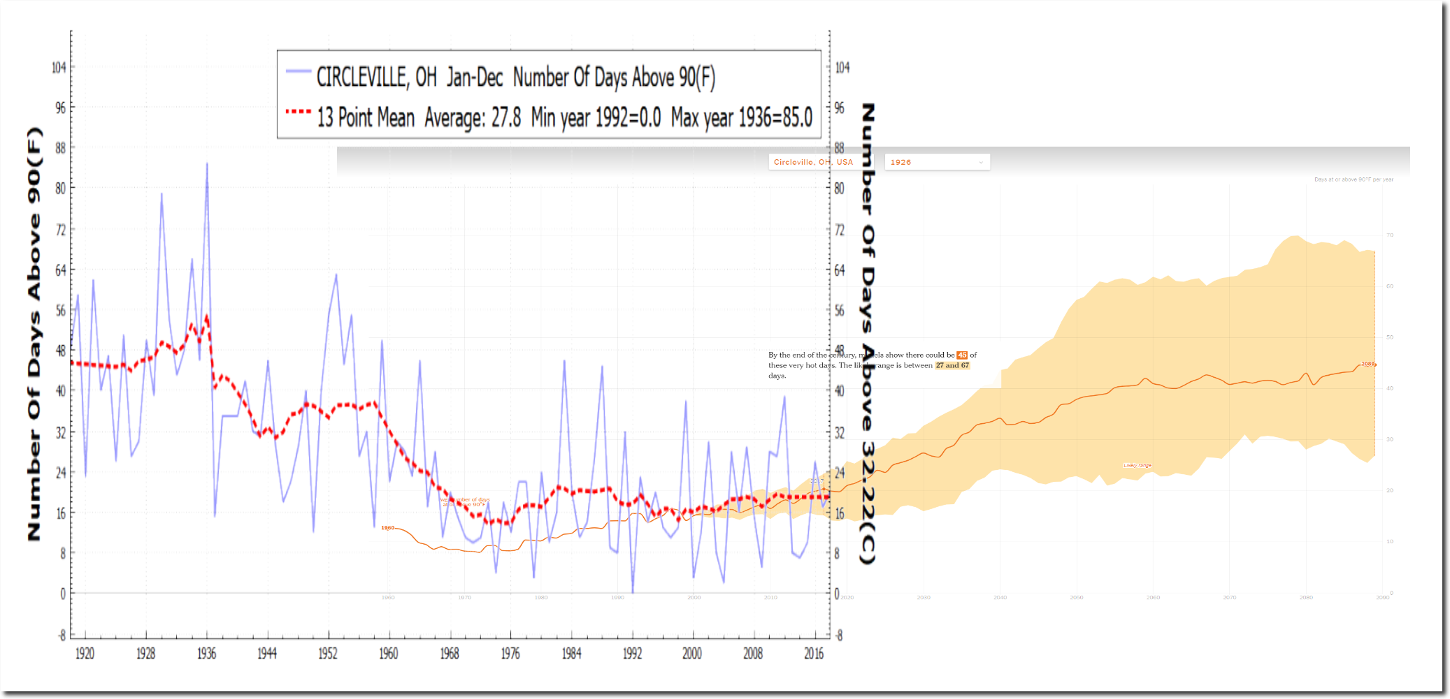
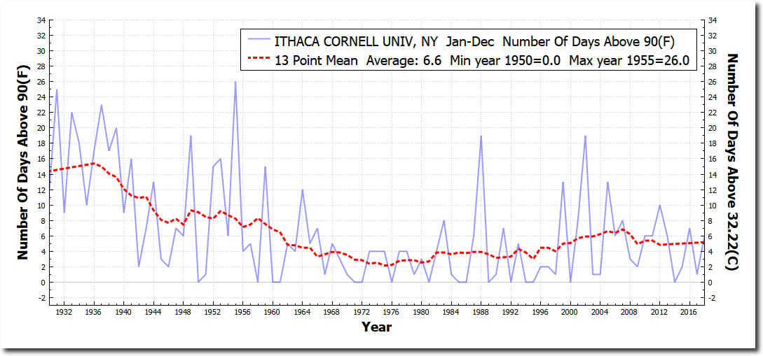
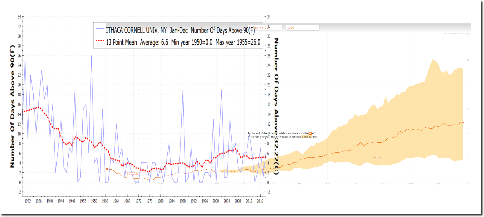
The next graph overlays the actual data from NOAA on the New York Times graph. Every thing about the New York Times graph is fraudulent. They show a sharply decreasing trend as a sharply increasing trend, they show the current data incorrectly, and they hide the hot years before 1960.

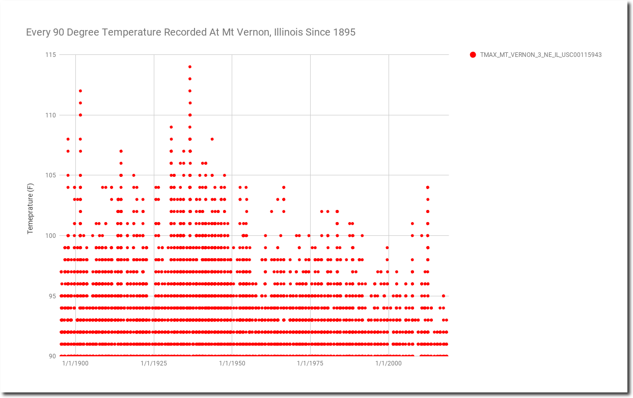
The graph below shows every 90+ degree temperature recorded at Mt. Vernon, Illinois since 1895.  Summers at Mt. Vernon are getting much cooler. They reached 114 degrees in 1936, but haven’t been over 100 degrees in almost seven years.

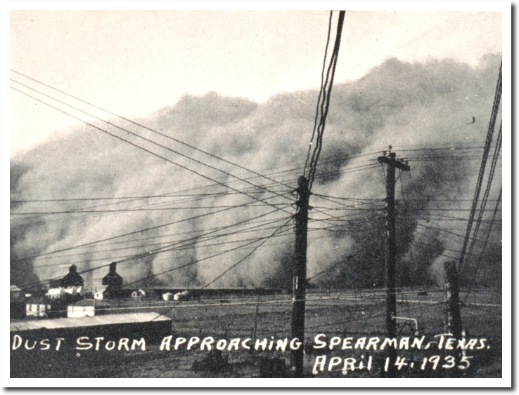
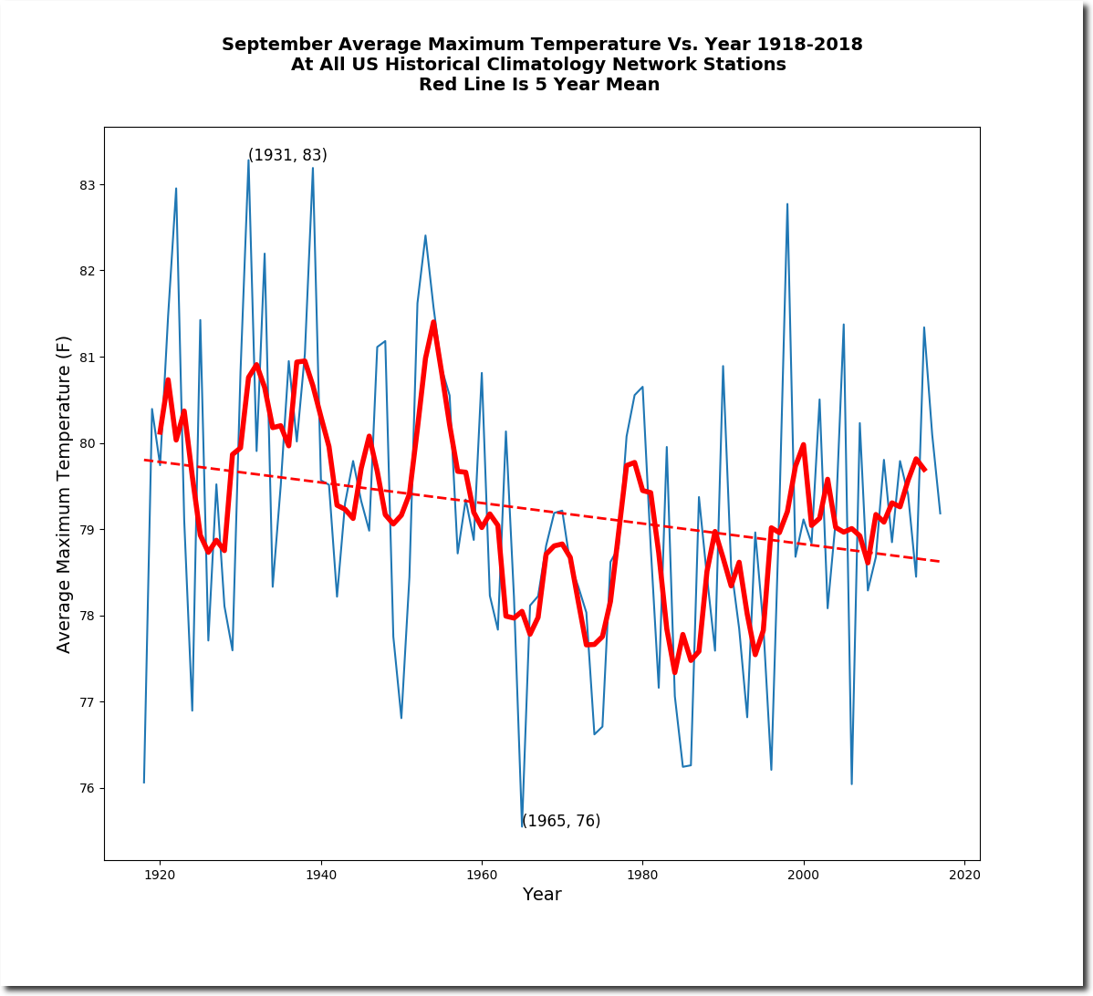
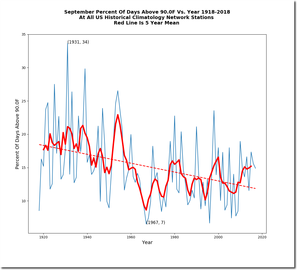
The reason the New York Times hides all of the pre-1960 data, is because the US was very hot prior to 1960, and that wrecks their fake news about global warming.

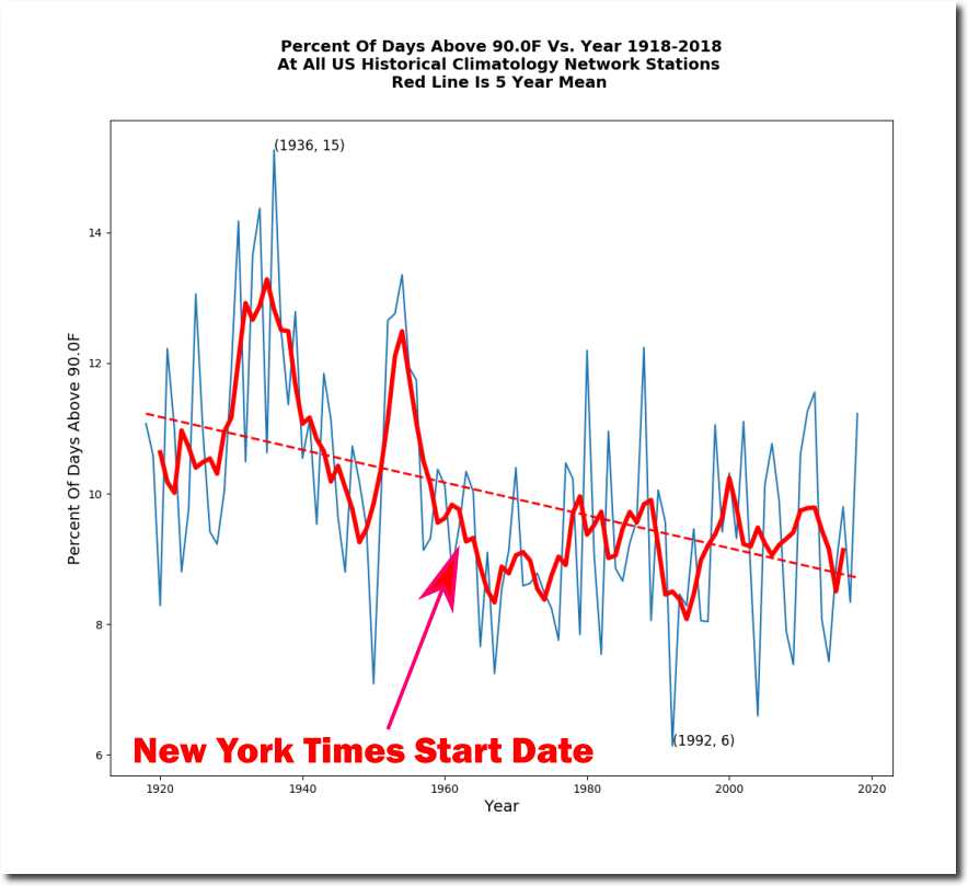
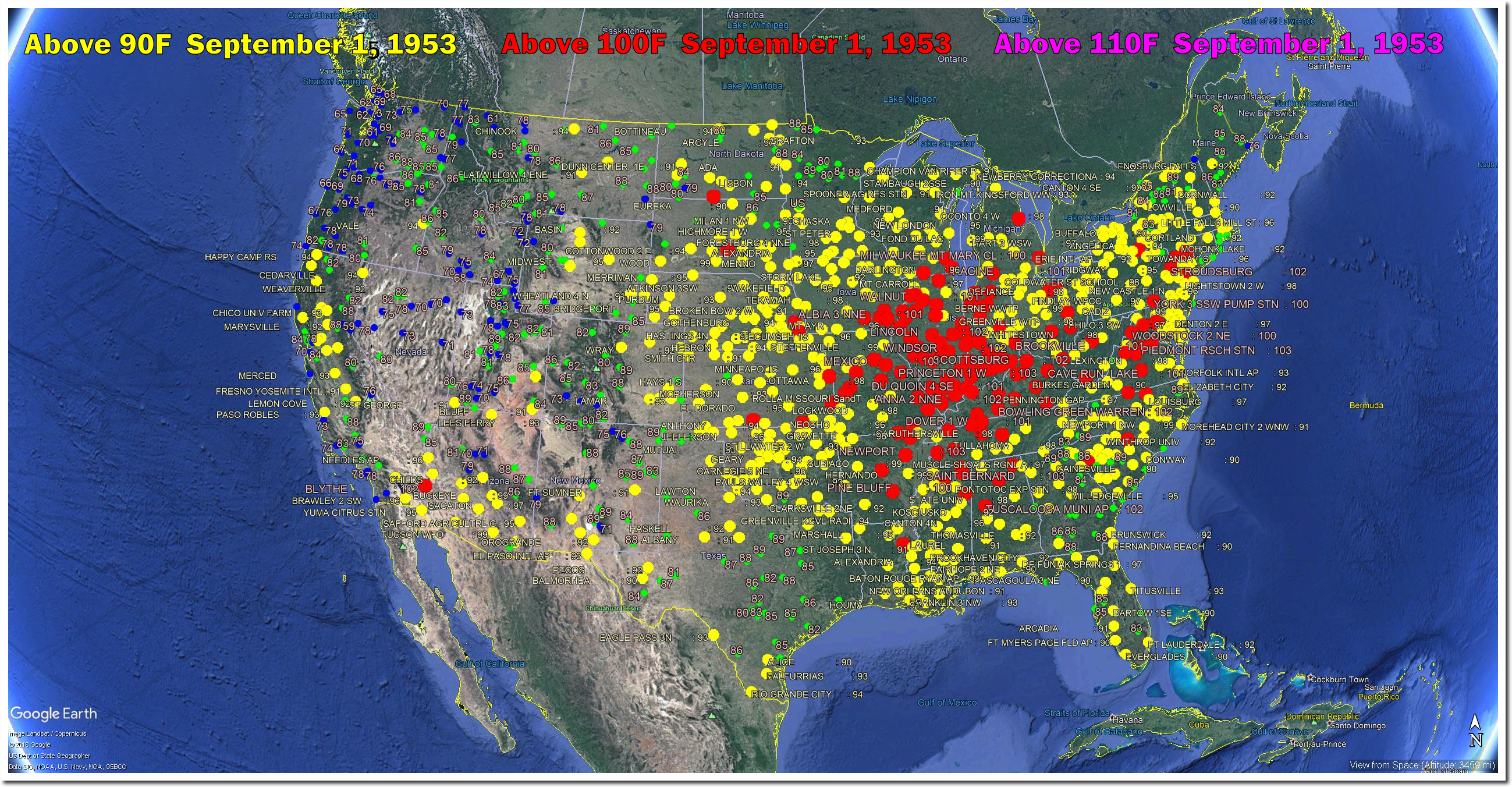
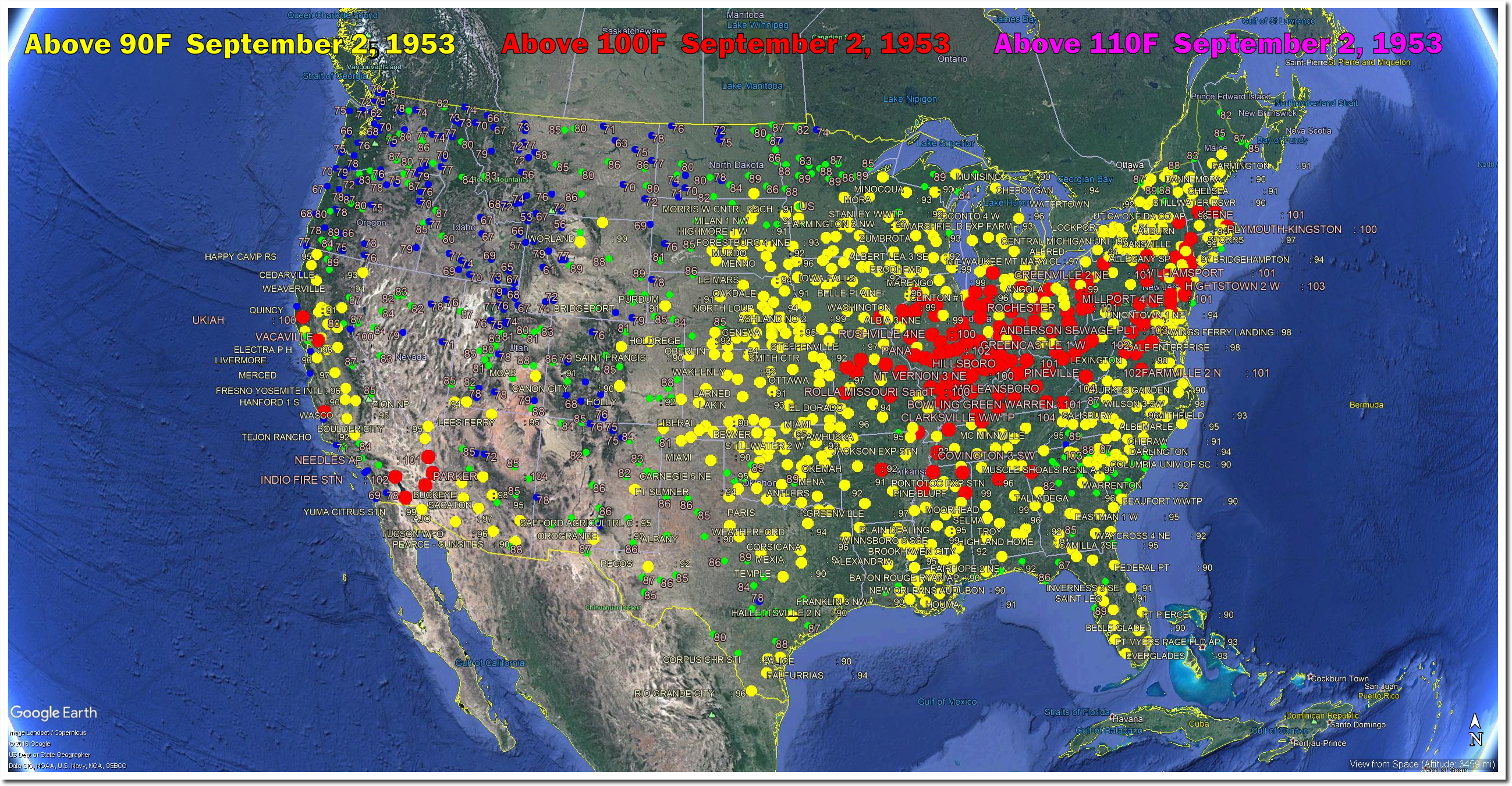
On this date in 1953, there were 100 degree temperatures from California to New England. Palestine, Illinois was 107 degrees – eighteen degrees warmer than today’s forecast.

The New York Times never makes any effort to correct or acknowledge their incorrect climate articles, indicating it is their policy to deceive their readers.

Posted in Uncategorized | Leave a comment

New York Times Fraud At Adrian, Michigan

The New York Times says 90 degree days at Adrian, Michigan are becoming much more common as CO2 increases.

How Much Hotter Is Your Hometown Than When You Were Born? – The New York Times

The actual NOAA data shows 90 degree days are becoming much less common at Adrian, Michigan as CO2 increases.

The graph below overlays the two graphs above at the same X-Y scale.

The New York Times is committing massive and shameless fraud. telling their readers the exact opposite of what the data shows.

Posted in Uncategorized | Leave a comment

Plummeting September Temperatures In The US

Prior to sixty years ago, September was a very hot month in the US. The average maximum September temperature has plummeted, as has the frequency of hot days.

On this date in 1953, much of the Eastern US was over 100 degrees.

Posted in Uncategorized | Leave a comment

New York Times Fraud At Circleville, Ohio

The New York Times claims Circleville, Ohio only got twelve days per year over 90 degrees around 1960.

How Much Hotter Is Your Hometown Than When You Were Born? – The New York Times

In fact, Circleville averaged closer to forty days per year around 1960. The New York Times lied by a factor of more than three. In 1936, Circleville had eighty-five days over 90 degrees.

July/August 1936 was nine degrees warmer than this year at Circleville, with almost every day in 1936 warmer than this year.

They claim the number of days over 90F has increased since 1960, when in fact it has decreased sharply.

And they project there will be a large increase in the number of 90 degree days as CO2 increases. The actual data shows that there has been a sharp decline in 90 degree days as CO2 has increased.

The chart below overlays at the same scale, the actual NOAA data and the New York Times fake data and fake projections.

Their claims about the past and the trends are 100% fraudulent, and the exact opposite of reality.  So basically typical New York Times reporting.

Posted in Uncategorized | Leave a comment

New York Times Fraud At Ithaca, New York

The New York Times claims that Ithaca, New York gets about three days per year over 90 degrees, when in fact they average almost double that.

How Much Hotter Is Your Hometown Than When You Were Born? – The New York Times

The number of 90 degree days has declined by 50% over the last 90 years, as CO2 has increased.

The New York Times claims the opposite trend.

A large percentage of New York Times reporting is fraudulent, and sometimes it is trivial to prove. They are hiding readily available historical data, reporting incorrectly on historical and present data, and claiming trends which are the exact opposite of reality. Scientific and journalistic fraud at its worst.

Posted in Uncategorized | Leave a comment

Greenland Gains Huge Amounts Of Ice For The Second Year In A Row

Early in life I had noticed that no event is ever correctly reported in a newspaper.

George Orwell

Summer is over, and Greenland’s surface has gained 510 billion tons of ice over the past year – about 40% above normal.  The surface mass budget is snow/ice accumulation minus melt.  It does not include ice loss caused by glaciers flowing to the sea, which is very difficult to measure, and is driven by processes which have little to do with the current climate.

Greenland Ice Sheet Surface Mass Budget: DMI

Last year Greenland gained a little more ice, about 50% above normal.

Greenland Ice Sheet Surface Mass Budget: DMI

The trajectories were very different last year and this year, but the final result was about the same.

Lining the two graphs up side by side,   you can see the more than one trillion tons of ice which Greenland’s surface has gained over the past two years.

Last year, the Danish Meteorological Institute reported on the gain in ice, and blamed it on Hurricane Nicole. I wonder what their excuse will be this year?

Guest post: How the Greenland ice sheet fared in 2017 | Carbon Brief

Even NOAA begrudgingly admitted that the huge ice gain was a “small increase.”

Greenland Ice Sheet’s 2017 weigh-in suggests a small increase in ice mass | NOAA Climate.gov

Meanwhile, the usual fraudsters in the press continue to report Greenland is melting and we are all about to die.

Posted in Uncategorized | Leave a comment