
Two years ago, this was one of the most popular statistics – but it has since gone missing. If you know its whereabouts, please call the official Obamacare number 1-800-382-5968
Two years ago, this was one of the most popular statistics – but it has since gone missing. If you know its whereabouts, please call the official Obamacare number 1-800-382-5968

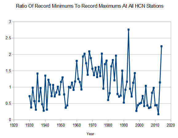
So anything below 1 (1:1 ratio) is warmer?
The true believers believe any stat means climate change!
You’ll probably need to create your own algorithm from raw. All inconvenient data is going to start disappearing.
So the ratio on your graph above was about 0.2 in the year 2011. That means there were about 5 times as many record maximums and record mimimums in 2011. The last data point, 2013, shows there to be about 2.2 times as many record minimums as maximums. The maximum records win. Is that due to UHI?
Or maybe it was 2012 and the last point is 2014. It’s hard to see on the graph.
Nice tel number!
Climate at a glance says of this page:
http://www.ncdc.noaa.gov/cdo-web/datatools/records
“Daily Weather Records
This tool is currently unavailable. Please check again in the future, and if you have any questions contact customer support.
The daily records summarized here are compiled from …”
I have no idea if it ever was available, if it was and now it’s not – Well then!
That is just climate, not weather. Or is it weather,not climate? Whatever!
Is that graph with or without the 30s/40s warming scrubbed?