
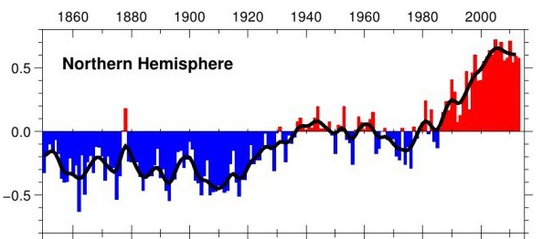
This is the current CRU Northern Hemisphere graph
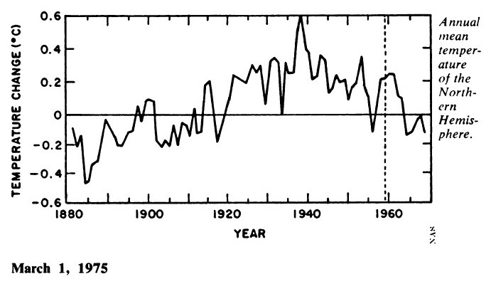
This was the 1975 National Academy of Sciences Northern Hemisphere graph
The next graph shows them overlaid on top of each other. They have erased the warmth from 1890 to 1960, and in particular the hot 1930’s
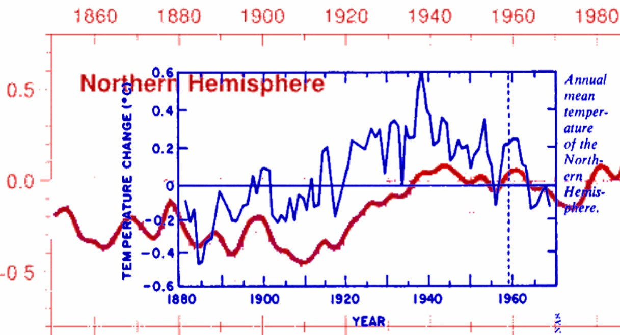
Like GISS and NOAA, the CRU temperature record is a complete fraud.

We have always been at war with Eastasia. — Orwell, 1984
Eventually there will be a new crop of scientists who want to know the actual truth of what happened in the past temperature record. My hope is that the original data have not been destroyed.
Winston Smith hard at work erasing the historical record….the whole point of the hockey stick fraud was to erase 1000 years of climate fact. I am sure the little kiddies are being fed with the lies and fraud of ‘science’ and told to memorize the lurid fantasies of the cult of warm.
Great work, Steve!
However, I don’t think it is quite as bad as what GISS & NCDC did to the U.S. data. From your graph, it appears that their adjustments have added only about 0.3 °C of warming since the 1975 version.
That’s less than what GISS & NCDC did. They added about 0.7 °C of warming to the U.S. surface temperature record, when 1998 is compared to 1934, in less than 15 years!
Or I could be wrong. This just documents subsequent adjustments to data for for years prior to 1976. The 0.7 °C of warming added by GISS & NCDC to the U.S. surface temperature record included temperatures is for years through 1998, and about half of that was warming added to the more recent years.
So may you are right. This might be just as bad as what NASA GISS & NOAA NCDC have done to the U.S. data.
Oops, if you look closely, that “1975” graph ends in 1968. The magazine article was published in 1975, but it used an older graph.
The 1975 magazine article used the graph from the 1975 NAS Report, which labeled the graph (“Figure A.6”) as follows:
Here’s the 1975 NAS Report:
https://ia801806.us.archive.org/7/items/understandingcli00unit/understandingcli00unit.pdf
The graph is on page 148 of the Report (which Adobe Reader calls page 172). Here’s the graph as it appears there:
http://www.burtonsys.com/climate/NAS_1882-1968_NH_temperatures_from_1975_NAS_Report.png