
Satellite data provides continuous high resolution temperature information across almost all regions of the Earth, and across all the layers of the atmosphere.
By contrast, surface data provides spotty low-resolution data which is UHI contaminated, tampered with, and scientists say suffers severely from time of observation bias.
Scientists of course choose to use the meaningless surface data, because the satellite data doesn’t show any warming.
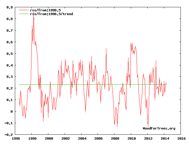
Never mind that NASA says the satellite data is more accurate. Funding is the important thing.
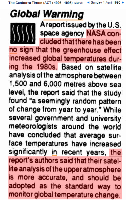
01 Apr 1990 – EARTHWEEK: A DIARY OF THE PLANET Global Warming

Makes purrrrrfect sense!! Ignore the Satellite data for Temperatures… But push certain Geographic Satellite data for Sea Levels!! That way everything fits into your Anonymously Peer Reviewed paper on Catastrophic Global Warming…
Funding + Grants=$$$$
Climate change (on Jupiter)
http://www.cnet.com/news/jupiters-great-red-spot-turning-into-little-red-dot/
Some of the comments are very good. I particularly like the suggestion to shoot liberals at it until the problem is “solved”.
The red is hiding in the bottom of our oceans per the alarmist cartoon graphs.
I think US data from 1930 was reliable, a lot more so than now.
If farmers were in charge of the SAT system, the data would be reliable.
Posted on DTT dot com.
Little did they understand that the super El-Nino of 1982-1983 and progression toward the super-dooper El-Nino of 1997-1998 would be their rather large mistake in calculations 😉
Climatologists rediscover the UHI:
“Excess heat from air conditioners causes higher nighttime temperatures”
http://phys.org/news/2014-05-excess-air-conditioners-higher-nighttime.html
It’s obvious, air condition lowers indoor temperatures, and raises outdoor temperatures.
By the way, are satellite temperatures not contaminated by UHI effect too?
I imagine that both the urban areas involved are way too tiny to influence a global area average and the overall urban heating effect on the bulk of the environment is also trivial even though it can grossly affect urban area thermometers.
On my bicycle, I often see 5-10 degrees difference in nighttime temperature between a small neighborhood and open space 50 yards away. All it takes is one asphalt road nearby to push temperatures way up.
But if those small roads appear once when a thermometer station is added somewhere, or were there all along, then over time there is little extra *trend* added to the readings any more than there would be if a billion year old black rock mountain range was nearby. Only growing urban areas would create trend errors over a whole state or country.
There is vastly more pavement than there was 70 years ago.
It depends on what thermoneter you use for your extrapolations and 1200 K anomaly spread. A much higer percentage of the used thermometers are now at airports.
Gail, you’re probably not too far from Tom Karl and his hairpiece, go thank him personally for that
I asked Chiefio years ago about why use of anomalies didn’t compensate for mere “hot areas being dropped” instead of “increasing trend” areas and he said it was hard to simplify any argument with such complex black box effects going on.
Q: “Isn’t the whole point of anomalies that using them instead of absolute temperature removes the problem that Smith is making a case for?”
http://wattsupwiththat.com/2010/01/14/john-colemans-hourlong-news-special-global-warming-the-other-side-now-online-all-five-parts-here/#comment-290781
A:
“E.M.Smith says:
January 15, 2010 at 12:48 pm
-=NikFromNYC=- (23:24:47) : “Global averages are presented as anomalies, meaning variations above/below an arbitrary time period’s average. If this was done for the input data too, then only the difference in variability of cold vs. hot regions would be modified by the great dying out of thermometers, not the absolute temperatures.”
Aye, now there’s the rub… It is NOT done for the input data. The anomaly map is calculated in the final land data step of GIStemp: STEP3. All the homgenizing, UHI adjustment, etc. are all done on “the monthly average of daily min/max averages”. Only at the very end is the Anomaly Map made.
There are a few points along the way in GIStemp where sets of averages of averages are calculated, and then offsets between these are used for some part; and technically you could call those “anomalies”, but they are not at all what folks think of when they think of anomalies. (For example, there is a UHI adjustment calculated in STEP2 in the PApars.f program. It does this by sprialing out (up to 1000 km) looking for stations to use. It adds up (about 10) of these and uses there (sort of a mean) as the comparision to the station to decide how much to adjust that station for UHI.
Yes, it is TECHNICALLY an anomaly calculation. But then the average of that (semi-random) set of “nearby rural” stations (up to 1000 km away and including major airports and cities with significant UHI) is thrown away and only the station data (now suitably adjusted) moves forward.
You see this all the way through GIStemp. Some average is used to adjust the station data average, then only the station data proceed. I would call these “offsets” rather than anomalies (and the code calls them offsets internally). Finally in STEP3, the Anomaly Map is made and “Ta Dah!!” it is “all anomalies so it’s perfect” is the mantra…
Well, one small problem. If there are insufficient “nearby rural” stations, the data is passed through unchanged. No UHI adjustent is done. So delete the rural stations in the present part of the data set, you get induced warming via no UHI correction. A very large percentage of “rural” stations now are at major airports (such as the largest Marine Base: Quantico Virgina). Any guess how warm it is on the Quantico airstrip right now with all the flights to Haiti? Delete the “real rural” airports, more of the UHI correction goes “the wrong way”, more induced artifical “warming”. All of this BEFORE the Anomaly step of STEP3.
I could go on with many other examples of how this works, but then I’d be retyping my whole blog. Just think on this: NOAA have announced that 100% of the pacific ocean basin will be from AIRPORTS in the near future (it is almost that now). A station on an island can “fill in” grid boxes up to 1200 km out to sea. So one hot station on, oh, Diego Garcia where we built a giant air base that is “rural” can, and does, warm a 2400 km diameter circle of cool ocean via “fill in”… and there being no “nearby rural” station to compare with, will get NO UHI correction. Think those islands airports changed much between the start of 1950 and the advent of the Jet Age Tourist boom in the 1980?s?
But that’s OK, the magical “anomaly” will fix it all up in STEP3 when we compare Diego Carcia today with what it was in 1950 …
There are three non-satellite global averages, GISS, Hadley and NCDC so there are three software packages to ask this question for. Isn’t the whole point of anomalies that using them instead of absolute temperature removes the problem that Smith is making a case for?
I can only speak to the process done inside GIStemp, but the fact that it has close agreement with NCDC and HadCRUT leads me to believe they are similar. Further, inside GIStemp the “dataset format” is called NCAR (As in NOAA NCDC North Carolina…) during the early steps then swaps to a HadCRUT compatible one for STEP4_5 where the Hadley Sea Surface Anomalies are blended in. This says that these folks share data formats (and thus at least the code to read and handle them). They also all work from the same set of “peer” reviewed literature, so will share methods from there as well. I’d love to take a team of programmers through all three and show how much they match, but there is only me and only one set of published code (GIStemp). NCDC is mum, and the UEA leak while helpful is not the whole code base.
Please forgive the length of this, but the “Anomaly” is a frequently used dodge by the AGW believers, and you can not get them to look at what really happens in the code… and it sounds so good… but it is just a “honey pot” to distract you from the real process being done to the data.”
Thomas R. Karl says
I have seen less brown stuff come out of the back of a bull…
Given the rise in carbon dioxide levels is expected to cause an enhanced “greenhouse” effect through adsorption of more outward long-wave radiation in the troposphere, I wonder why we bother looking at surface and ocean temperatures. If there is no discernible warming in the troposphere (particularly over the tropics), the cause of any increase in surface/ocean temperatures will be something other than the extra carbon dioxide.
Well said. You can’t get increasing back radiation from something that isn’t warming itself. It’s like expecting to get more heat from a radiator when the radiator itself isn’t warming.
Sounds like my diesel pk-truck when the winter temps are minus 20 °F and below – BRRRrrrr.
Do you know what a reflector is? Do you know how a reflector works?
Do you know what reflection is? Do you know what absorption and re-radiation are?
I work with it everyday. Do you?
(BTW, you in no way answered the question.)
Tom Karl has no control of satellites. Tome Karl only has control over the adhesive for his hair piece and what comes out of NCDC,
In a couple of years Tom will only control one of these HA HA HA HA HA