
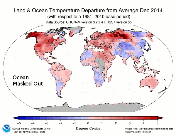
NCDC publishes lots of bright red maps like this one, where most of the surface temperatures are fake.
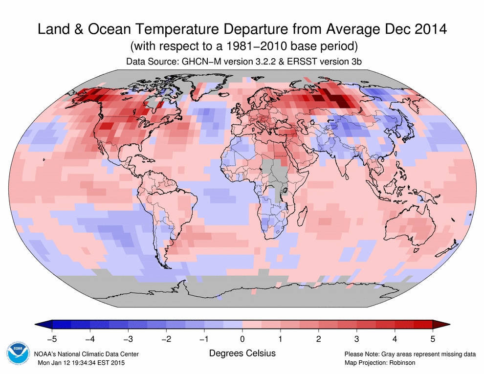
The animation below flashes between the measured and reported data. In December, 2014 they turned Saudi Arabia red hot without a single thermometer reading in the country, despite the fact that most of the measured data in the region was below normal.
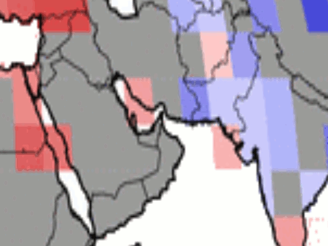
Satellite data showed that most of Saudi Arabia was cooler than normal in December
NCDC creates fake temperatures for the majority of the land surface using an algorithm which skews temperatures upwards, then reports a record temperature by 0.02 degrees.
Scientific malfeasance doesn’t get much worse than this.

This is why they got rid of so many rural stations. It allows them an excuse to smear UHI across the globe.
So apparently, if they had one thermometer in Alaska and one in Australia, these turnip-brained experts could ass-trapolate temps for the whole globe.
Reblogged this on Climatism.
Here is the plan:
Three thermometers for California,
Seven thermometers for the entire equator,
Nine thermometers for Washington, DC,
But ONE thermometer will rule them all….inside Mount Doom, of course! 🙂
And isn’t the whole “global warming” lark based on the fact that “temps have risen 0.8 degrees since 1880”?
Wonder how many readings that 1880 temp was based on? Especially those from North and South Poles?
And –
“Doctor Livingstone, I presume? How’s your weather station doing? Don’t forget to email figures to NOAA/GISS/UEA etc”
The WeatherBell global temperature analysis based on the NCEP global model initialization data looks more like the satellite analysis and is based on way more temperature data than the global climate network, although I’m guessing it is constrained to four daily initializations to compile a daily average for each grid cell. Below is their December 2014 analysis.
Their recent global temperature trends also appear to match the satellite trends much better than GISS, NCDC, and HadCRUT and their plot has a resolution of days rather than months or years.
Certainly no record warmth globally for 2014 from this approach, which in my mind makes more sense to take advantage of huge numbers of measurements with much better global coverage the the climate network.
Reference:
http://models.weatherbell.com/temperature.php
They already have a January 2015 global temperature anomaly map posted.
Well, WP didn’t like my html, but see the reference link to find the plots.