
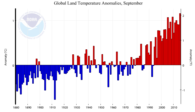
Lots of headlines today that September was the hottest ever – by a wide margin. The level of fraud which NOAA had to use to obtain this result (ahead of Paris) is quite stunning.
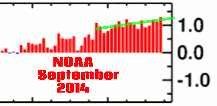
The first thing to note is the massive data tampering they did since last September. They increased the temperature of all recent years to get rid of the hiatus.
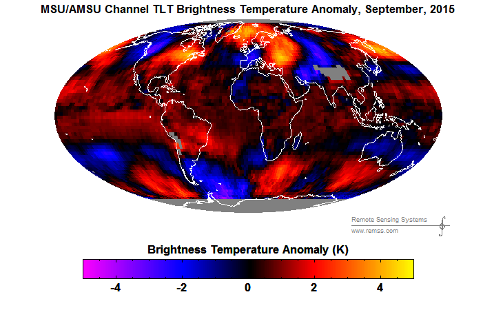
But that is the least of their fraud. They generated this red colored map, which does not even vaguely represent their measured data.
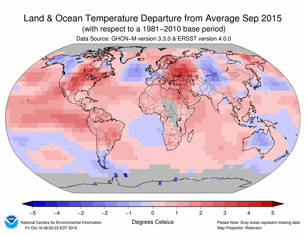
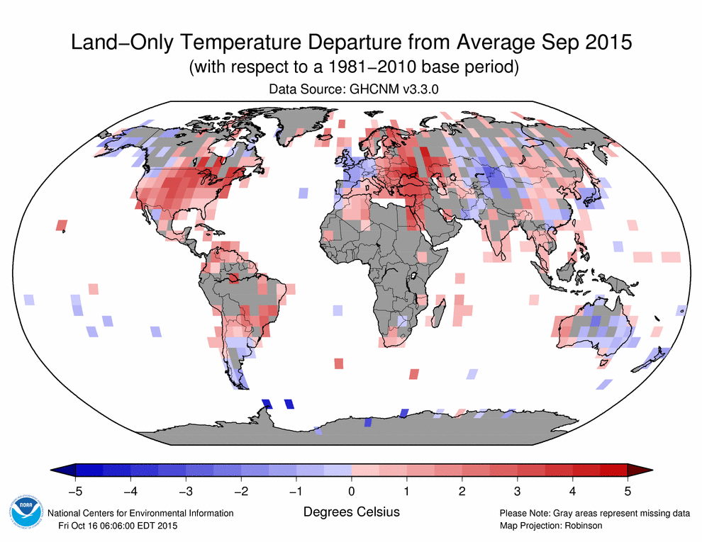
The map below shows their actual station data. They have coverage for less than 50% of the land surface, meaning that more than half of their surface temperatures in the map above are fake. Note that there are only two warm areas – the US and eastern Europe. They simply made up fake temperatures in the missing areas to paint their map red.
Satellites show that the land surface was close to average in September, and satellites have much better coverage than NOAA.
NOAA’s land-only temperature anomaly was 1.16°C, generated from primarily fake data. By contrast, the satellite UAH land only anomaly was 0.15°C – the coolest September since 2008. Satellites tend to exaggerate warming during an El Nino, so the NOAA fraud is much worse than it seems.
vortex.nsstc.uah.edu/data/msu/v6.0beta/tlt/uahncdc_lt_6.0beta3.txt
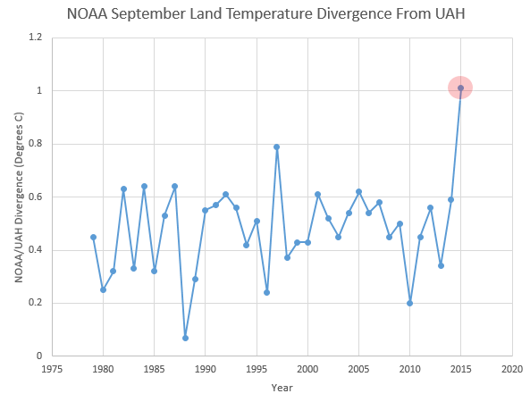
NOAA simply bumped temperatures up by about 0.5 degrees this month, in order to give Obama the propaganda he needs ahead of Paris. Normally NOAA diverges from UAH by about 0.5°C, but this month they pulled the brakes and ran their cheating up to more than 1°C.
NOAA has recognized that they can take this fraud as far as the White House needs them to, until Congressional Republicans finally get their act together.

I think that’s a typo. The warm spot shows in Eastern Europe and down south from there.
In UAH Land , September 2015 was 15th warmest September in the 37 year record.
It just tickles me that they can extrapolate one small pink square for thousands of miles…
….but the little blue squares do not do that
Perhaps they reason that hot spreads, and cold does not. Either that or lying in that way suits their purposes, whereas anything else would not.
OK, why are there almost no data points along the west coast of Central Africa? There are major airports there (Accra, Abidjan, Lagos, Libreville, etc.) and they also record climate at the many secondary fields. It doesn’t even look like they recorded temperature at Dakar, a major international airport. They smear red all over the continent, even to wiping out the blue points in western Morocco and eastern Botswana. Neat tricks all around.
I just learned that the Russian word for “committee” is “soviet.” Therefore “consensus science” is “soviet science” – or “Stalin’s science.”
The only site that is worth looking at its hurting them real bad do not give up Mr G
Reblogged this on Climatism and commented:
“It [global warming] is the greatest and most successful pseudoscientific fraud I have seen in my long life as a physicist.” – Emeritus Professor of Physics at the University of California, Harold Lewis, on resignation from the American Physical Society.
Not much has changed since Harold resigned from the APS in 2010.
Where does National oceanographic and atmospheric administration get the data from for ocean surface temperatures?
http://www.ospo.noaa.gov/Products/ocean/sst.html
Thanks!
So the gif showing Sept 2014 vs. Sept 2015 NOAA temps indicates that even last year, they got the data massaging wrong for that particular month and all preceding years. Is it an admission that the data collected is simply junk? The continual year on year adjustments make no sense what so ever if the weather stations and measurement techniques and instruments are the same year after year.
“The continual year on year adjustments make no sense what so ever if the weather stations and measurement techniques and instruments are the same year after year.”
Even more nonsensical is the fact that each succeeding year’s adjustments seem to always increase the imaginary warming trend. Perhaps the strongest argument that fraudulent adjustments are taking place (as opposed to merely incompetent adjustments) is that the trends are always warmer and warmer. Mere incompetence would certainly throw in some cooling of the records now and then.
Very simply, if the data has known, verifiable, documented and explainable errors, then by all means, adjust it — BUT ONLY AFTER EXPLAINING HOW AND WHY. Changing data without explanations adequate for duplication is not science. It is mere assertion, and the people doing so are not scientists, but rather are liars pretending to be scientists.
RE: the animated GIF at the beginning of your post: X axis is not labeled. It would help if you could tell us where exactly the data came from for the two bar charts in the GIF. As it stands, you simply present a GIF, you say “look at the fraud,” but you don’t tell us how to independently verify your assertion.