
Gavin has done so much data tampering since January, that he had to extend the Y-axis on the NASA global temperature graph in order to accommodate it.
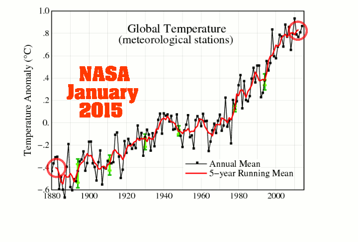
Gavin has done so much data tampering since January, that he had to extend the Y-axis on the NASA global temperature graph in order to accommodate it.

I am a bit out of touch with temperature data this year but when I was updating NASA figures, I noticed that the 2014 global anomaly has been increased from 0.675c at the end of 2014 to 0.748c at end of Sept. 2015.
In addition, most of the anomalies since 1979 have been increased and most since 1948 have been reduced.
Unfortunately I haven’t saved the data files from earlier this year, so I don’t know when this change was made.
Internet Archive WayBack Machine
https://archive.org/web/
Thanks, I’ll update my files!
The constant tampering and changing of data is what Tony Heller monitors.
You can subscribe to this blog. Tony constantly provides updates on the tampering.
Actually I have subscribed for at least 2 years but I don’t always get the time to read all of Tony’s posts.
It’s crazy. Finally they succeed in erasing the “blip”.
And the recent hiatus! Now, the former “blip” is the only hiatus visible on the graph!
Absolutely vomitory.
It will end with a linear then perfect exponential curve. At that rate we will fastly reach the 2°C “tipping point”, but I guess that this “point of no return” wont impede them to force us to cut carbon emissions, despite it’s too late according to their mind scheme.
Now the present hiatus is gone, does the bottom of the sea’s hidden heat will resurface ? What an easy escape trick, you can hide 1°C of the atmosphere in 0.001°C (true numbers) of the oceans… Unverifiable because of an obvious margin of error.
Anything goes now. Even in Texas and Louisiana, 18″ of rain in a week is not enough to change the drought situation:
http://droughtmonitor.unl.edu/data/pngs/20151020/20151020_usdm_home.png
The whole thing has become a joke.
Probably hydrophobic water.
Yes Psalmon, USDA is a joke. I remember several years ago when the SE (Georgia, SC & N. Florida was dry. Droughtmonitor was still showing extreme drought and the weather service & Palmer index was showing flood areas simultaneously for the same area.
Was the worst case I had seen, until this year when their boundary for drought for N. Wis & the U.P. crossed over a good chunk of Lake Superior. Not sure how you can call it drought in 300′ of water.
Psalmon, most of the heavy rain in Texas occurred after the 7 am CDT October 20 valid date for this Drought Monitor map. Our heaviest rainfall here in Central Texas was on October 24. I expect the next Drought Monitor map valid 7 am October 27 will show some big changes (should be made available on October 29).
Reblogged this on Climate Collections and commented:
NASA data creep…