Hiding The Decline In Missouri

One of the primary excuses used by NOAA to hide the decline in the US temperature record, is Time Of Observation Bias (TOBS.) The theory is that people used to be incredibly stupid and reset their max/min thermometers only once per day – in the afternoon. This would cause double counting of some high temperatures, and result in historical temperatures which were too high.

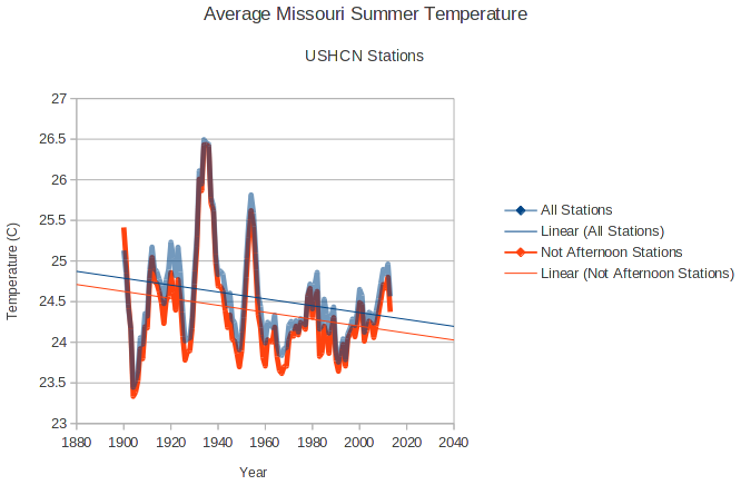
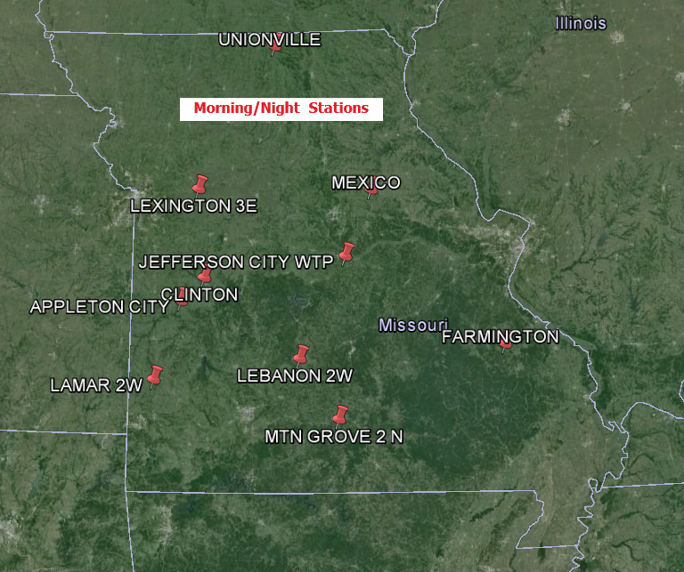
This theory is easy to test.  Half of the stations in Missouri took their min/max readings during July 1936 in the afternoon, and the other half took them at morning or night during that month. I separated those groups out and found that it makes no difference to summer temperature trends.

The group of morning/night stations has been cooling at almost exactly the rate as the group of all stations. Also note that summer temperatures in the 1930’s are essentially identical in the two groups. No matter what tricks NOAA uses to hide the decline in US temperatures, it doesn’t change the facts.
2016-04-24131710

Morning/night stations.

                                                                  
APPLETON CITY           MO  USC00230204
CLINTON                 MO  USC00231711
FARMINGTON              MO  USC00232809
JEFFERSON CITY WTP      MO  USC00234271 
LAMAR 2W                MO  USC00234705
LEBANON 2W              MO  USC00234825
LEES SUMMIT REED WR     MO  USC00234850
LEXINGTON 3E            MO  USC00234904
MEXICO                  MO  USC00235541
MOBERLY                 MO  USC00235671
MTN GROVE 2 N           MO  USC00235834
SPICKARD 7 W            MO  USC00237963
UNIONVILLE              MO  USC00238523

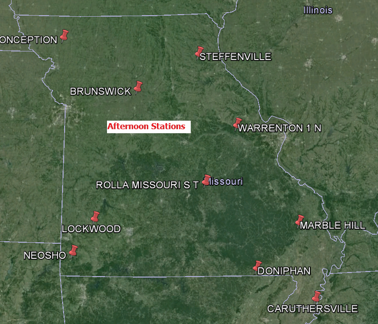
Afternoon stations

BOWLING GREEN 1 E       MO  USC00230856
BRUNSWICK               MO  USC00231037
CARUTHERSVILLE          MO  USC00231364
CONCEPTION              MO  USC00231822
DONIPHAN                MO  USC00232289
LOCKWOOD                MO  USC00235027
MARBLE HILL             MO  USC00235253
NEOSHO                  MO  USC00235976
ROLLA MISSOURI S T      MO  USC00237263
STEFFENVILLE            MO  USC00238051
SWEET SPRINGS           MO  USC00238223
TRUMAN DAM   RSVR       MO  USC00238466
WARRENTON 1 N           MO  USC00238725
2016-04-24174728 2016-04-24174740

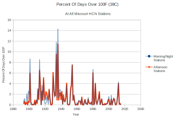
Another important test is the percentage of days over 100 degrees, comparing morning and afternoon stations. The result of this interesting – the morning/night stations actually have a higher frequency of hot days than the afternoon stations. This is the opposite of what TOBS theory would predict, and most likely due to the fact that the morning stations are generally further southwest than the afternoon stations.
2016-04-24173030

There is no indication that TOBS has a serious biasing effect, and no indication that the NOAA adjustments being done are legitimate.

Posted in Uncategorized | 11 Comments

A Repeat Of 2014?

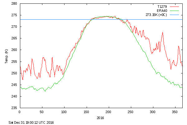
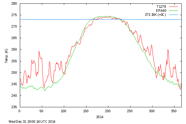
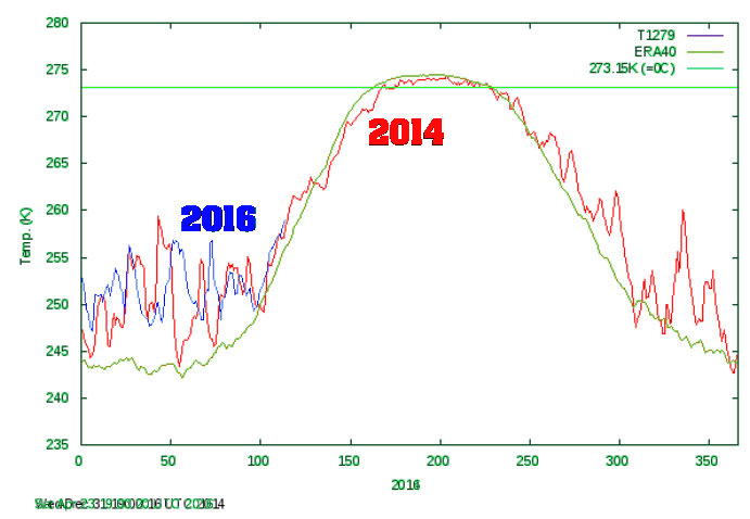
Arctic temperatures this year have been behaving almost identically to 2014, which went on to be one of the coldest summers on record  north of 80N.

2016-04-24111722

meanT_2016.png    meanT_2014.png

Posted in Uncategorized | 9 Comments

Hiding The Decline In The US

EarthBurning

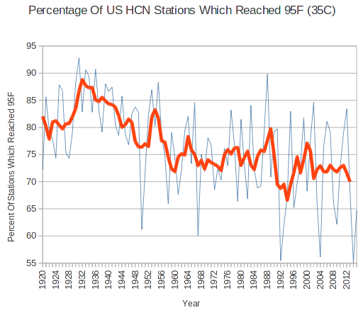
A favorite scare tactic of climate alarmists is that we are going to burn up in scorching summer heat. The evidence is overwhelming that the exact opposite is happening.

The areal coverage of hot afternoons in the US has plummeted over the last 95 years.

2016-04-24070210

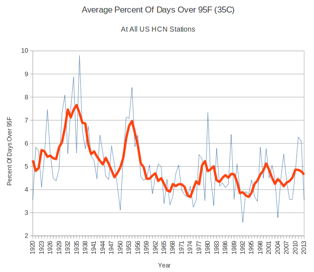
The frequency of hot afternoons have also plummeted.

2016-04-24082057

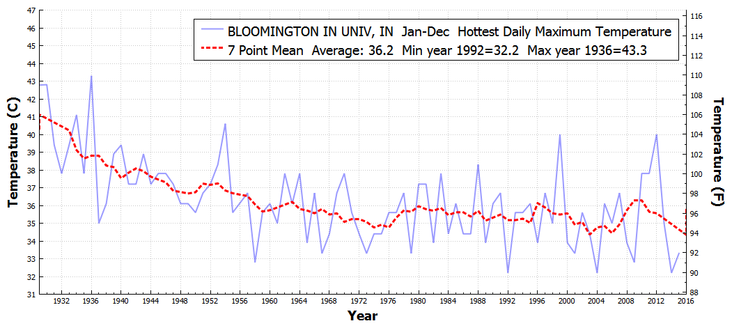
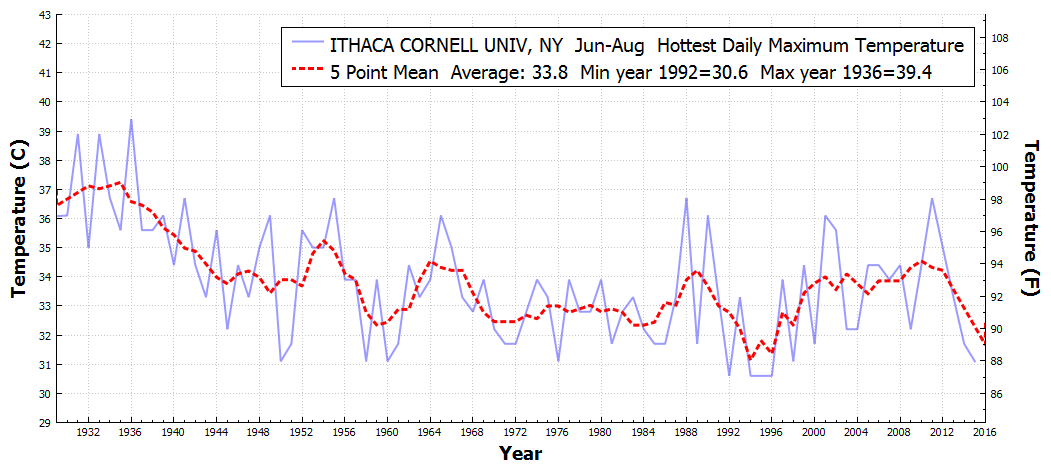
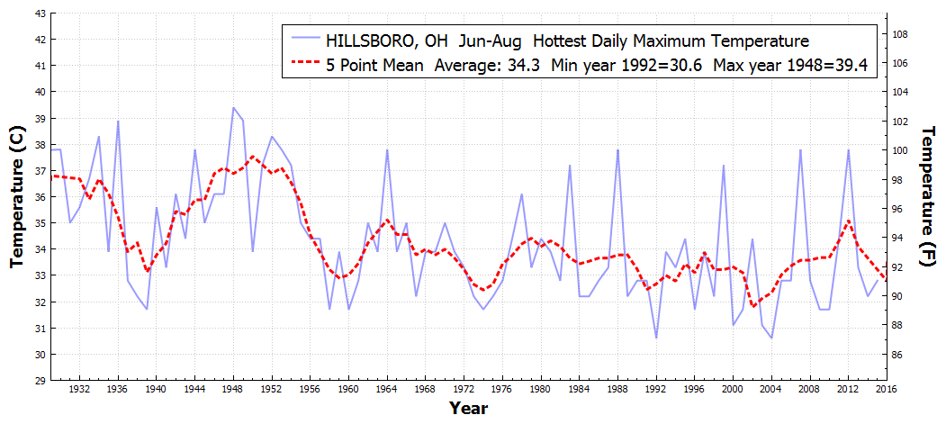
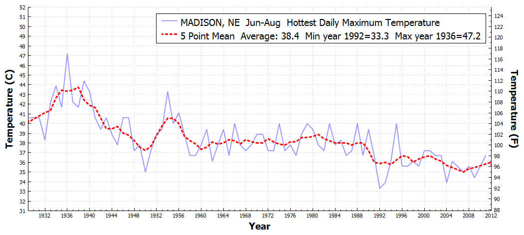
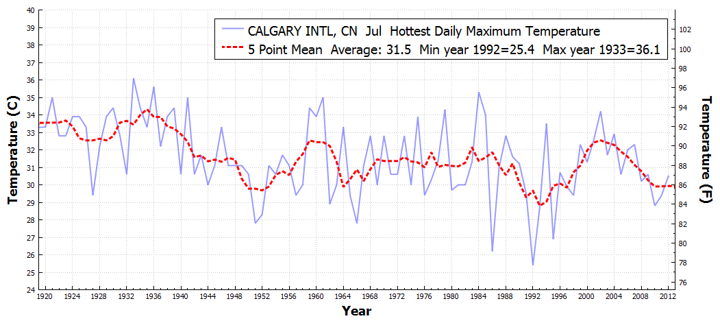
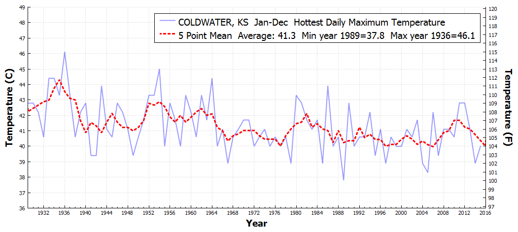
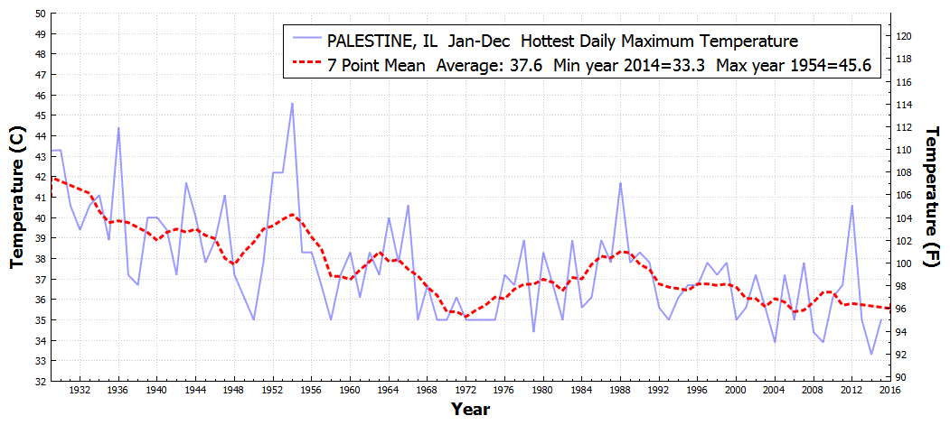
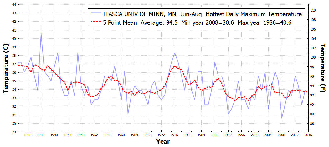
And the hottest temperatures has also plummeted.

BLOOMINGTONINUNIV_IN_HottestDailyMaximumTemperature_Jan_Dec_1930_2015

ITHACACORNELLUNIV_NY_HottestDailyMaximumTemperature_Jun_Aug_1930_2016

STATECOLLEGE_PA_HottestDailyMaximumTemperature_Jun_Aug_1930_2016 HILLSBORO_OH_HottestDailyMaximumTemperature_Jun_Aug_1930_2016 MEEKER5W_OK_HottestDailyMaximumTemperature_Jun_Aug_1930_2016

MADISON_NE_HottestDailyMaximumTemperature_Jun_Aug_1930_2016

CALGARYINTL_CN_HottestDailyMaximumTemperature_Jul_Jul_1920_2016FTSCOTT_KS_HottestDailyMaximumTemperature_Jan_Dec_1930_2015 COLDWATER_KS_HottestDailyMaximumTemperature_Jan_Dec_1930_2015 PALESTINE_IL_HottestDailyMaximumTemperature_Jan_Dec_1930_2015 ITASCAUNIVOFMINN_MN_HottestDailyMaximumTemperature_Jun_Aug_1930_2016

July temperatures in Fort Scott, Kansas averaged almost 20 degrees hotter in 1954 than they did last year, which was NOAA’s HottestYearEver™

FTSCOTT_KS_DailyMaximumTemperatureF_Jul_Jul_1954_2015 Climate alarmism depends on a complete ignorance of both science, and history.

Posted in Uncategorized | 7 Comments

More On The CU Sea Level Screw Up

2016-04-23102014

2004 version: sl_cu2004_rel1.2.pdf     2015 version: 2015_rel2

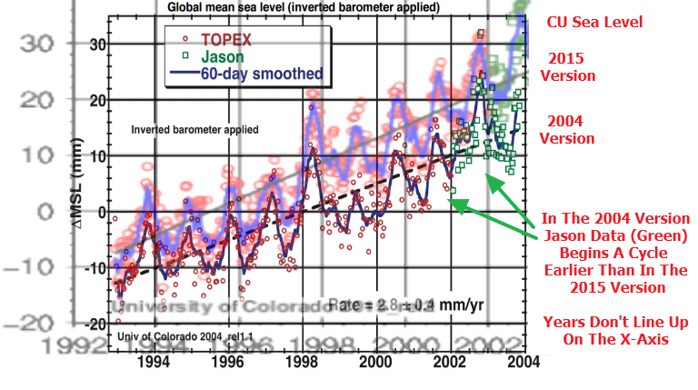
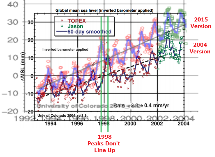
Based on comments yesterday, I am not sure that everyone recognized the gravity of this CU sea level disaster. Not only don’t the years line up on the X-Axis between the two versions, but in the 2004 version the Jason data begins an annual cycle earlier than in the 2015 version.

I have tried to figure out what sort of error could lead to this type of mess, and can’t fathom how it could have happened. It looks like they are just making data up.

Posted in Uncategorized | 8 Comments

More Boulder Smoking Guns

I live in the epicenter of climate fraud, surrounded by NCAR, NOAA, NSIDC and the University of Colorado – who showed in 2004 that sea level was rising 2.8 mm/year.

2016-04-23091134

sl_cu2004_rel1.2.pdf

By 2015, they had bumped that up to 3.3 mm/year, even though their graph showed sea level rise had slowed after 2004.

sl_global (1)

2015_rel2: Global Mean Sea Level Time Series (seasonal signals retained) | CU Sea Level Research Group

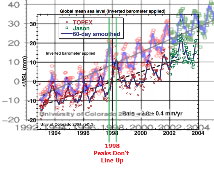
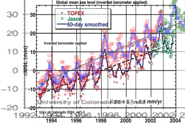
I overlaid the two graphs at the same scale below, and you can see several interesting smoking guns. The first is obvious – they simply increased the rate of sea level rise from 1993 to 2004 . But the more interesting one is that the peaks no longer line up. In the earlier version, the 1998 peak came in 1998. Now it comes in 1997. This tells us that they are either completely incompetent or are simply making stuff up.

2016-04-23093706

I can make the peaks line up by expanding the X-axis of the 2015 graph, but then the years don’t line up and the Jason data starts a year later in the 2015 graph than it does in the 2004 graph. It is apparent that these people are simply making data up as they go along, and not being very careful about it.

2016-04-23102014

Carl Mears recently used satellite orbital decay as an excuse to bump up RSS temperatures (as if they hadn’t already corrected for that.) Orbital decay would be a huge problem for sea level readings, because they require sub-millimeter precision.

CU satellite data reports almost double the rate of sea level rise as NOAA tide gauges, and orbital decay would be a likely culprit for the discrepancy. But they won’t fix it, because it would hurt their funding if the did.

2016-04-23100344

the absolute global sea level rise is believed to be 1.7-1.8 millimeters/year.

Sea Level Trends – Global Regional Trends

Adjustments are made to increase funding, not increase accuracy.

Posted in Uncategorized | 12 Comments

Superstition Is Occurring With Alarming Frequency In The US

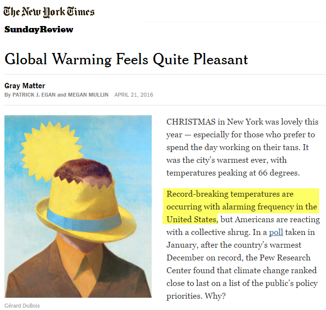
The New York Times believes that a warm Christmas in New York proves global warming, and that “Record-breaking temperatures are occurring with alarming frequency in the United States.

2016-04-23041613

Global Warming Feels Quite Pleasant – The New York Times

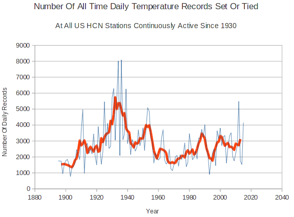
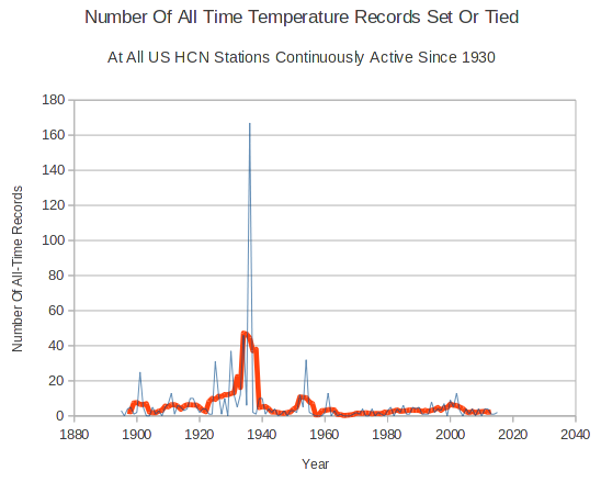
Like everything else the New York Times writes about climate, this claim is complete nonsense. The frequency of maximum daily temperature records in the US peaked in the 1930’s – and have generally declined since then.

2016-04-23040349

For stations with history extending back to at least 1930, almost all US all-time temperature records occurred before 1940.

2016-04-23040852

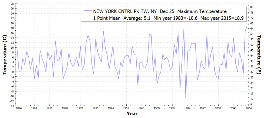
Last Christmas was the warmest on record in New York, beating 1982 by two degrees.

NEWYORKCNTRLPKTW_NY_MaximumTemperatureOnADayOfYear_Dec_25_1895_2016

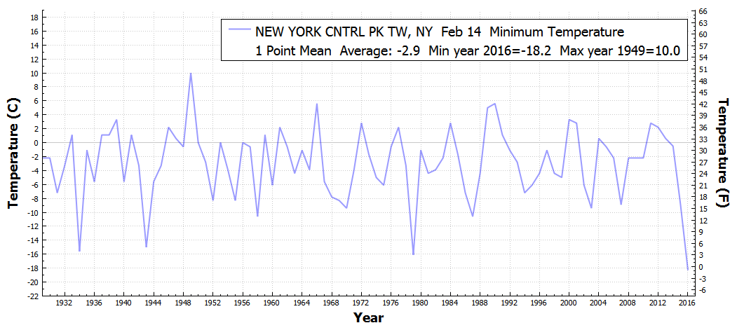
Valentines Day this year was the coldest on record in New York.

NEWYORKCNTRLPKTW_NY_MinimumTemperatureOnADayOfYear_Feb_14_1930_2016

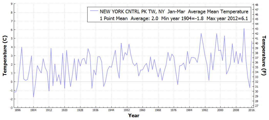
Last year January through March was the coldest in New York City since 1934.

NEWYORKCNTRLPKTW_NY_AverageMeanTemperature_Jan_Mar_1895_2016

This is a typical content-free climate article for the New York Times. The author obviously did no research and is just making stuff up.

Posted in Uncategorized | 21 Comments

NSIDC Busted!

Reader Chris71 has discovered the smoking gun on the NSIDC web site. Read on.
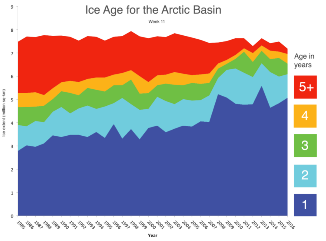
A few weeks ago, NSIDC put out this press release, claiming that 5+ year old ice is at its smallest level on record.

ice at least 5 years or older, is at its smallest level in the satellite record, representing only 3 percent of the total ice cover

2016-04-22061634

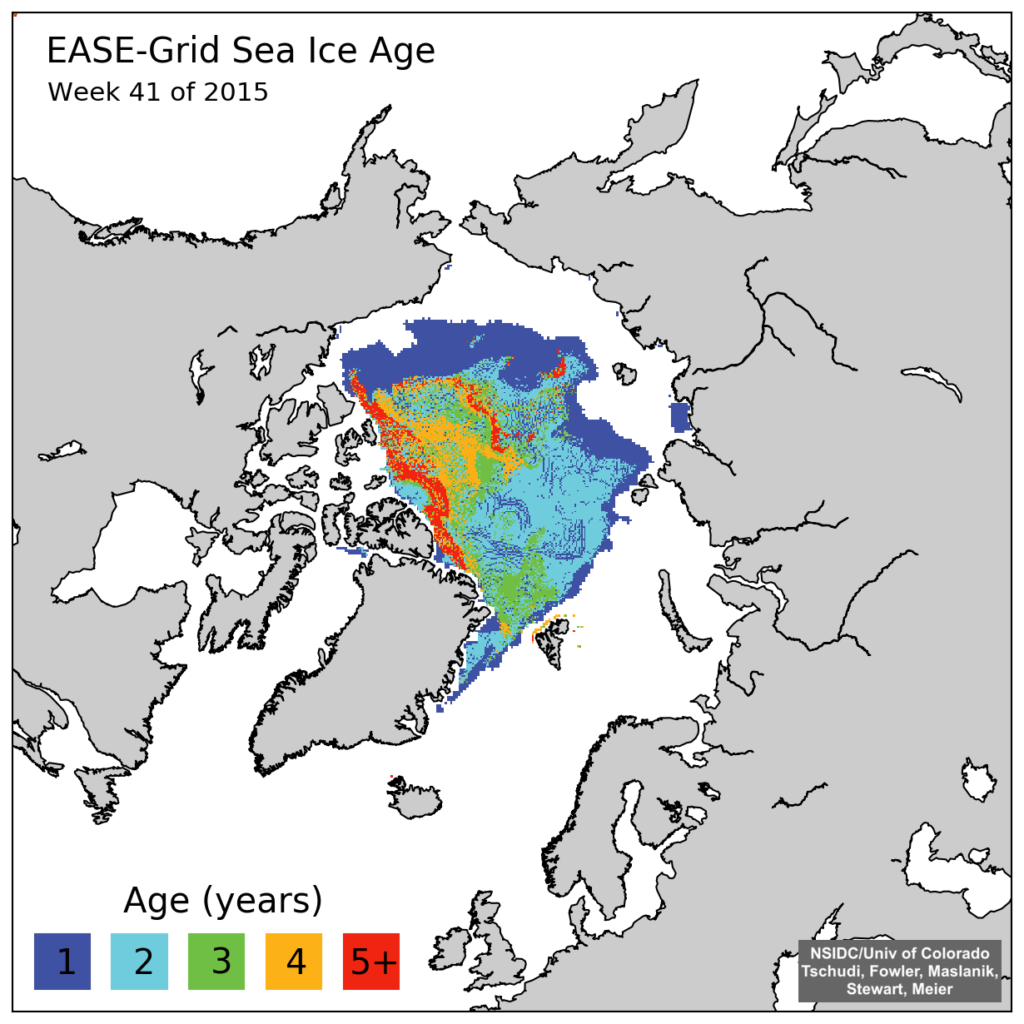
The press release included the map below. This is a new style map which they just started in week 39 2015. The map below is for week 41 2015. All of their previous  1984-2015 maps have been deleted from their archive.
iceage_browse_week_n_2015_41

March ends a most interesting winter | Arctic Sea Ice News and Analysis

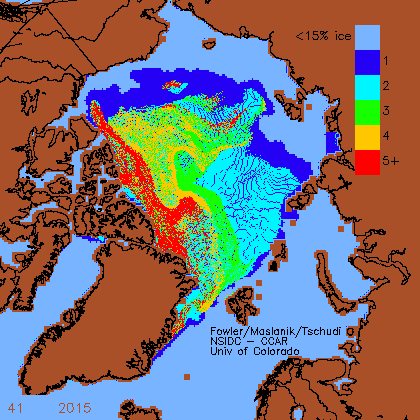
The good news is that Chris found one of their old style maps which had not been scrubbed from their website, and is annotated with the following text.
This graph is reloaded from ftp://ccar.colorado.edu/pub/tschudi/iceage/gifs/age${year}_${month}.gif every day and is available here as http://www.arctic-charts.net/ccar.colorado.edu/pub/tschudi/iceage/gifs/latest.gif

latest

www.arctic-charts.net/ccar.colorado.edu/pub/tschudi/iceage/gifs/

NSIDC has deleted the original graphs, but seem to have forgotten to get rid of the copy.

2016-04-22195319

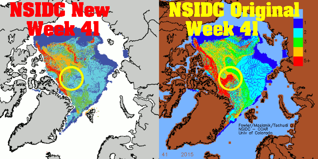
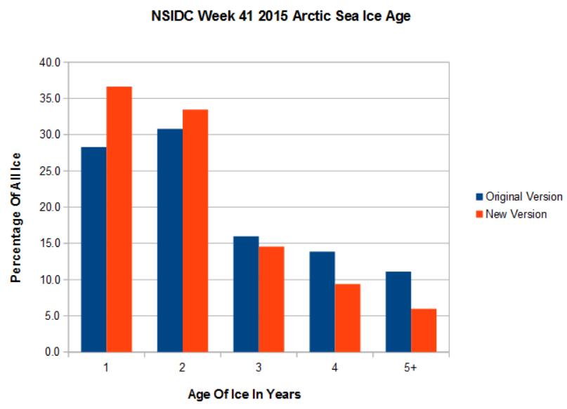
Here is where they get in trouble. Besides deleting data, NSIDC also deleted a lot of older ice when they switched maps. Note inside the circle how the red five year old ice has disappeared in their new maps.

NSIDC-week41-2015-old-vs-new

The alterations are huge, and shown in the graph below. NSIDC deleted almost half of the five year old ice when they switched to the new maps. They also deleted about a third of the four year old ice, and some of the three year old ice.

2016-04-22195454

Referring back to the top graph again, it becomes clear what they are up to. Had they used the same map set for the 2016 data as they did for all the other data in the graph below, 2016 would have had the most 4+ ice since about 2009. The graph below is junk science, useful only for propaganda.

2016-04-22061634

It is bad enough that they switched data without telling anyone and used it to generate meaningless propaganda, but they also deleted all of the 1984 to week 36 2015 data from the disk. Fortunately they missed one map, which is the smoking gun. If the old data was that bad and needed to be deleted, then any comparisons made between the old and new data are extremely misleading- which is exactly what NSIDC was doing. They tracked that region of five year old ice for several years, and then suddenly decided it didn’t exist. Unbelievable.

They are busted, big time.

Posted in Uncategorized | 92 Comments

A Modern Day Moses In The White House

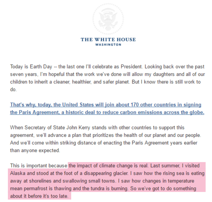
On Earth Day, Obama announces that he can stop glaciers from melting.

2016-04-22154447

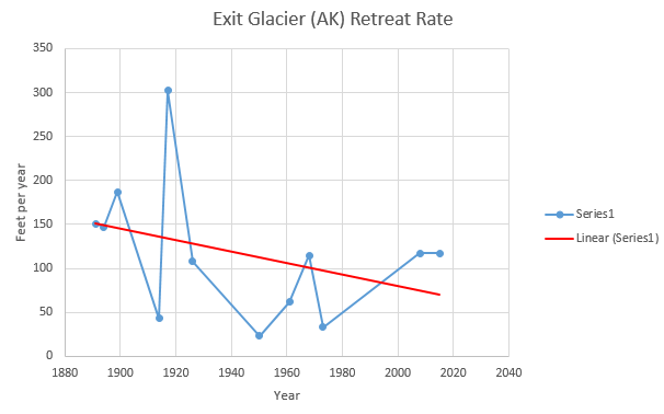
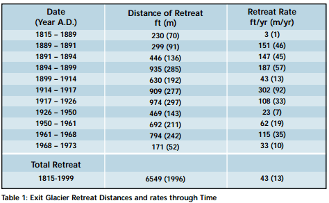
Obama visited the Exit Glacier. According to US Park Service documents, the melt rate of that glacier was twice as fast a century ago.

ScreenHunter_2934 Sep. 06 12.40

ScreenHunter_2831 Sep. 01 18.11

www.nps.gov/kefj/learn/nature/upload/The Retreat of Exit Glacier.pdf

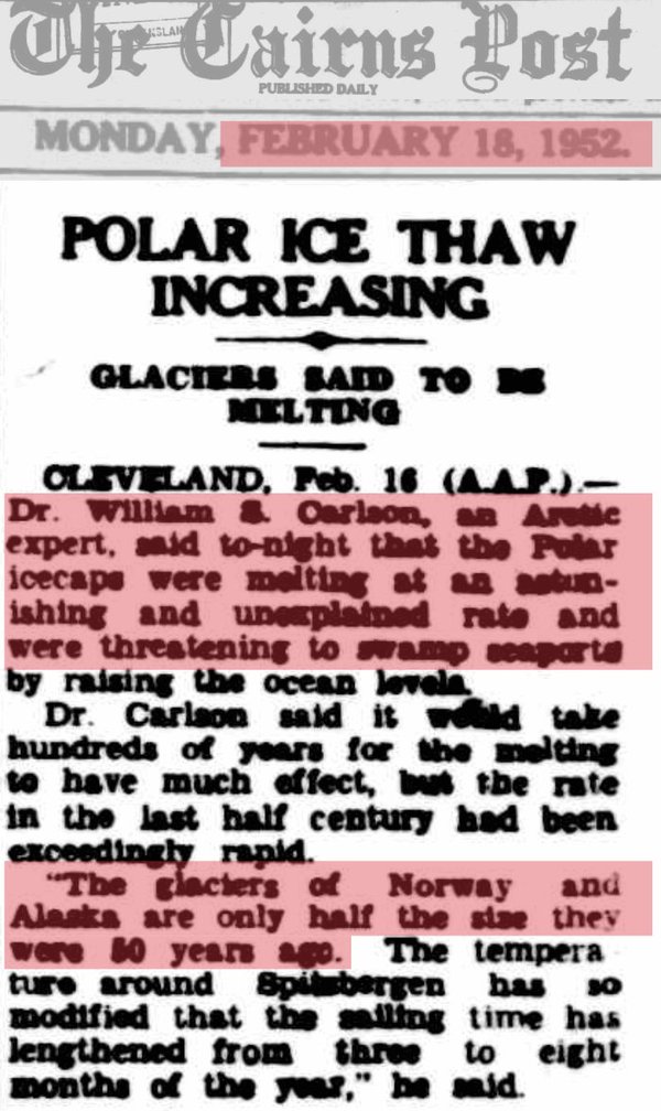
The glaciers of Alaska lost half their mass between 1900 and 1950.

CeH8bfyUsAAbWEY

18 Feb 1952 – POLAR ICE THAW INCREASING – Trove

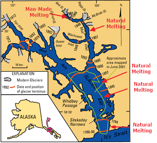
In 1879, John Muir found that Alaska’s largest glacier had retreated 48 miles.

Explorer Captain George Vancouver found Icy Strait choked with ice in 1794, and Glacier Bay was barely an indented glacier. That glacier was more than 4000 ft. thick, up to 20 miles or more wide, and extended more than 100 miles to the St.Elias Range of mountains.

By 1879 naturist John Muir found that the ice had retreated 48 miles up the bay. By 1916 the Grand Pacific Glacier headed Tarr inlet 65 miles from Glacier Bay’s mouth.

Glaciers and Icebergs of Glacier Bay National Park in Southeast Alaska

Every single president going back to George Washington could have watched Alaskan glaciers retreat.

glacierbaymap (3)

glacierbaymap.gif (420×458)

It is dangerous having idiots running the country. Trump has a very different idea.

“This very expensive global warming bullshit has got to stop.”

  • Donald Trump
Posted in Uncategorized | 11 Comments

NSIDC Caught Cheating – Yet Again

In 2012, I caught NSIDC cheating, just as Arctic sea ice extent was about to cross above the 1979-2000 average. They changed their measurement system using a completely bogus mathematical trick. NSIDC argued with me about it for a while, and eventually admitted that their nature trick was garbage.

NSIDCsNatureTrick

NSIDC’s 2012 Nature Trick | Real Science

They have done a much bigger cheat this time, in order to generate this propaganda:

ice at least 5 years or older, is at its smallest level in the satellite record, representing only 3 percent of the total ice cover

2016-04-22061634

March ends a most interesting winter | Arctic Sea Ice News and Analysis

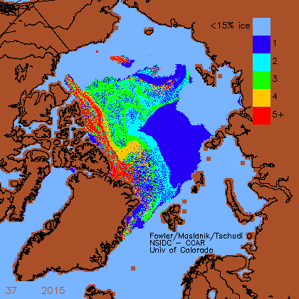
From week 1 1984 to week 37, 2015 NSIDC generated ice age maps in this format:

PaintImage160

ftp://ccar.colorado.edu/pub/tschudi/iceage/gifs/

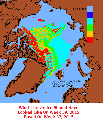
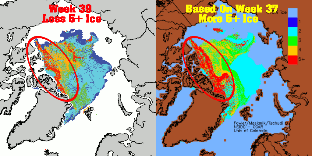
Week 38 (late September) is the week when the ice has its birthday, and all of the ice advances one year. I generated the map below of what week 38 should have looked like, based on advancing the ice age one year. There should have been a large increase in 5+ ice, because all of the 4 year old ice became five year old ice on week 38.

PaintImage162

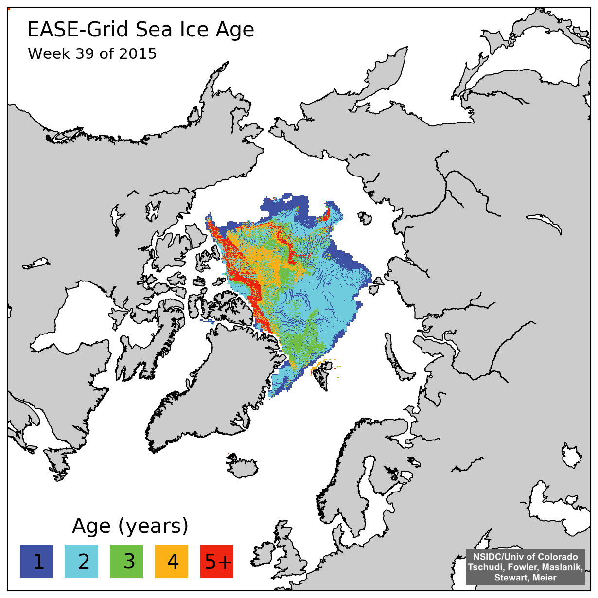
However, that didn’t happen. What they did was change to a new set of maps on week 39, and actually deleted the directory containing the 1984-2015 maps.  They never generated a week 38 map. Very naughty.

iceage_browse_week_n_2015_39

iceage_browse_week_n_2015_39.png (1230×1230)

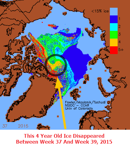
A large area of four year old ice not only didn’t age, but it disappeared entirely.

PaintImage160

The animation below shows what the map should have looked like compared to what it does look like. They massively reduced the amount of five year old ice that should have been present in the map.

NSIDC-week37-2015-vs-week-39-2015

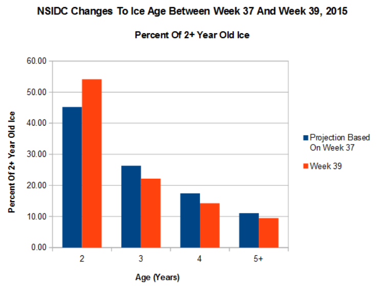
The graph below shows the sum total of they did. When they switched maps, they decreased the amount of 3, 4 and 5+ year old ice, and increased the amount of two year old ice.

2016-04-22070659

Not only did they they alter the data, but they also deleted the evidence. And to make matters worse, they blocked auto archiving of the 1984-2015 data.

2016-04-22065408

The data is not lost however. I have all their old maps archived here. Did they really think I wasn’t going to catch them?

Posted in Uncategorized | 47 Comments

Oldest Thickest Arctic Sea Ice Continues To Increase

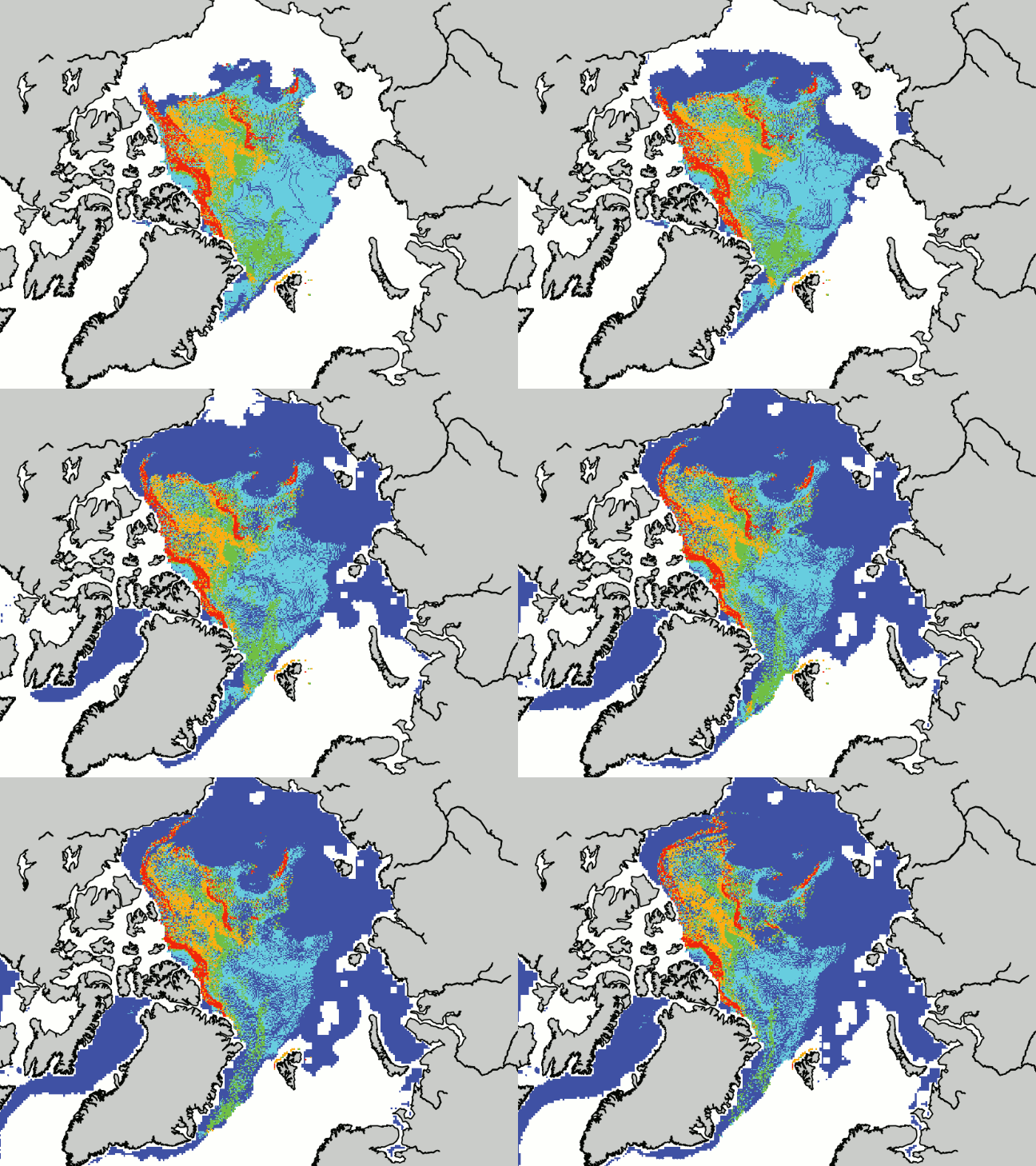
From about 1988 to 2007, the Arctic lost large amounts of multi-year sea ice (MYI) due to winter winds blowing it out into the North Atlantic. That pattern has since reversed, and as you can see below, older and thicker ice is moving away from the Atlantic and into the Beaufort Sea, and becoming older and thicker.

Week 39 2015 to Week 16 2016

Iceage_2015-2016

2016-04-21210847 2016-04-21210840 2016-04-21210834

Index of /pub/tschudi/iceage/images/

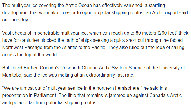
Seven years ago, experts announced that all the MYI was gone, but they have had to move on to different scams to raise funding since then – because that one didn’t work out very well for them.

2016-04-21211445

2016-04-21211812

Multiyear Arctic ice is effectively gone: expert | Reuters

Posted in Uncategorized | 20 Comments