It is an incredibly clear day today. I took this picture of NCAR from 2.4 miles away.

Then I rode my bike up to NCAR (first bike ride in three months, after being ill. Thanks for all your prayers.)
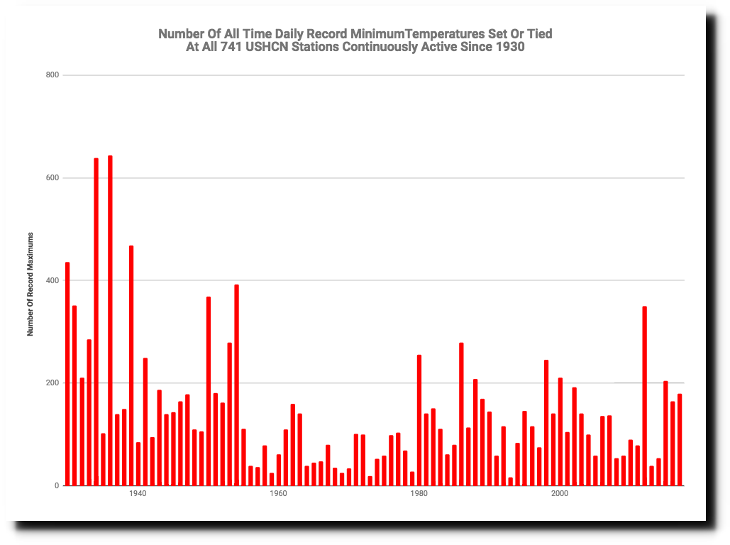
The NCAR museum has this spectacularly deceptive graph, claiming to show that record maximum temperatures are increasing in the US.

Their graph was carefully cherry-picked to start at a low point in the 1950’s, which cooled sharply after 1954. Had they started the graph in 1930, it would have been obvious that record maximums are declining in the US.
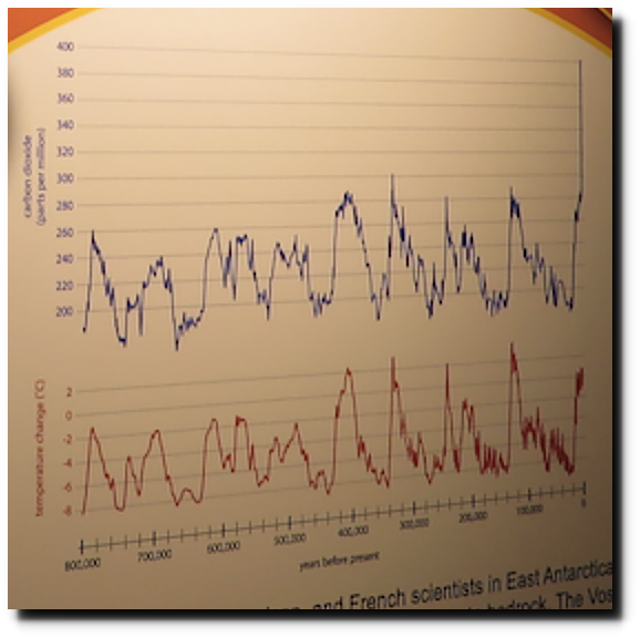
Next to that fake graph is this fake graph, designed to show that CO2 drives temperature. They forgot to mention that the relationship is the exact opposite – CO2 lags temperature, and is driven by decreasing solubility of carbonate ions as seawater temperature increases.
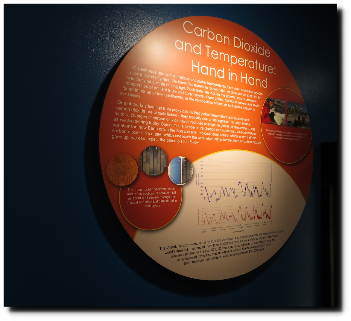
Is anyone at NCAR actually stupid enough to believe that a 100PPM swing in CO2 produces a 10C swing in temperature?
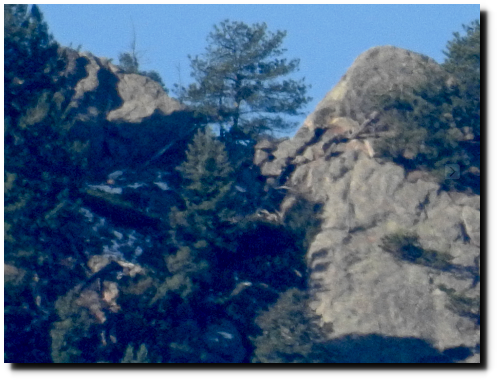
Today was a very clear day for climate fraud at Kevin Trenberth’s NCAR. This picture was taken from four miles away.