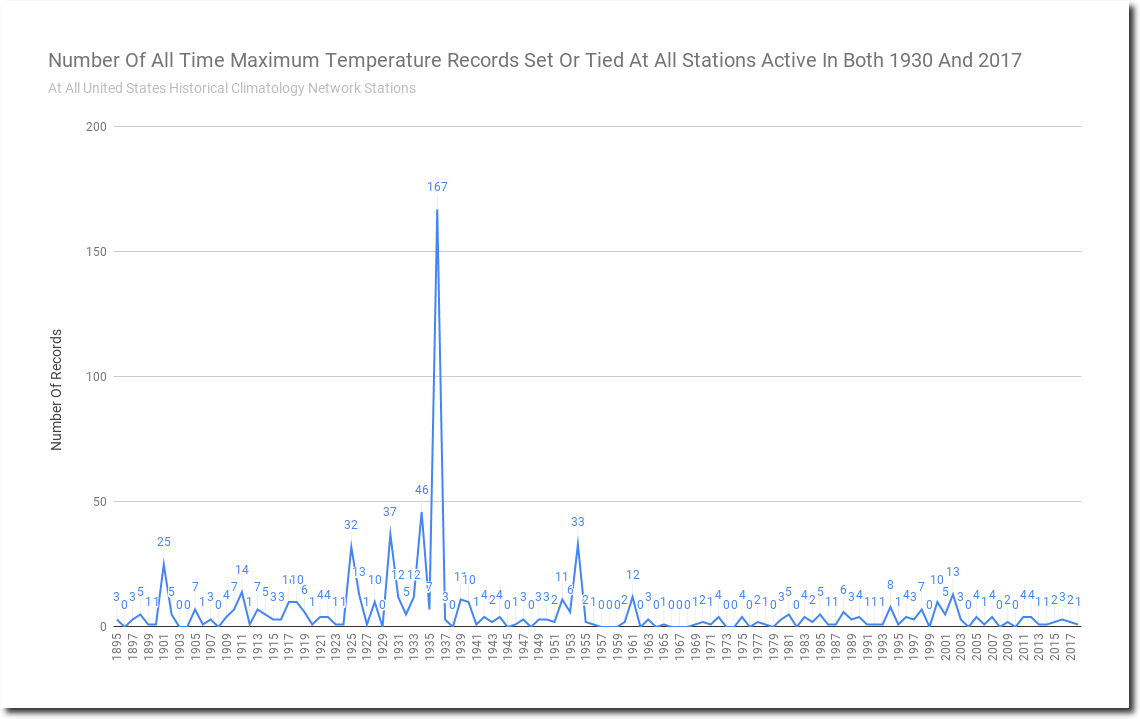
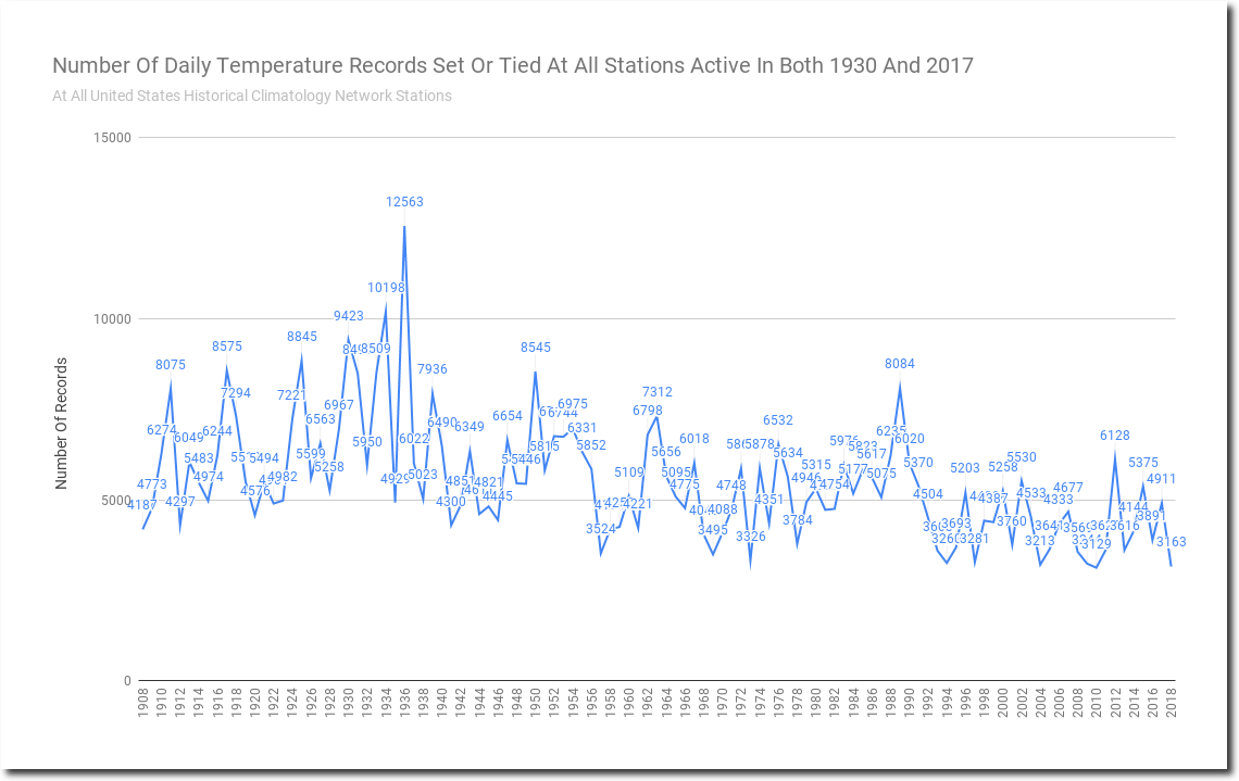
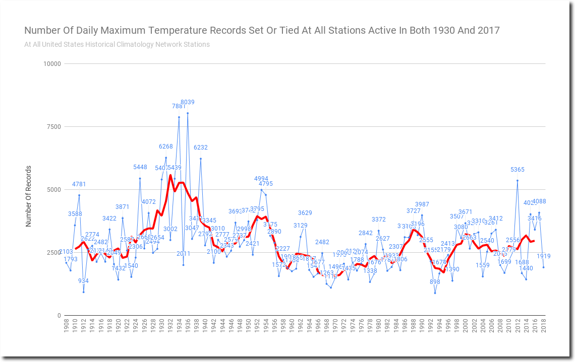
The latest graphing conspiracy theory is that shape of the graphs are affected by the fact that fewer stations report now than 30 years ago. If I plot the same graphs for the set of all stations which were active in both 1930 and 2017, the evidence is even stronger – because stations with short term records excluding the hot 1930’s, don’t get included.
The US used to be much hotter than it is now. Reality is difficult to accept by climate alarmists.