Do I understand this correctly. I have followed the link and see the graph there.
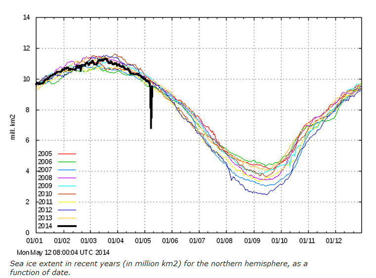
So they publish a graph that says that the ice lost 2.5m sq km overnight and then regained it overnight the next night ?
And they expect to be taken seriously , and do not correct or notate this oddity ?
This is not the first data lapse with that chart. I think it was noted twice last year here. My suspicion is that Steve left off the SARC tag while poking fun at the website. It is probably the most reliable site for Arctic ice charts out there.
The graphic above accurately represents what is on the website, per clicking the provided link.
I can understand a lapse. That might not be the best way to represent it, however,
and is not accompanied by any note or explanation .
“The plot above replaces an earlier sea ice extent plot, that was based on data with the coastal zones masked out. This coastal mask implied that the previous sea ice extent estimates were underestimated. The new plot displays absolute sea ice extent estimates. The old plot can still be viewed here for a while.”
This is hardly something to get worked up over, it was an error, they corrected it. There is enough deceit from the climate terrorists without having to go looking for something.
Last year, when it became painfully obvious that the “Death Spiral” was a bunch of bologna, we changed our methodology so we could just wave our hands every time someone pointed out a discrepancy & pretend we were right all along.



Do I understand this correctly. I have followed the link and see the graph there.
So they publish a graph that says that the ice lost 2.5m sq km overnight and then regained it overnight the next night ?
And they expect to be taken seriously , and do not correct or notate this oddity ?
This is not the first data lapse with that chart. I think it was noted twice last year here. My suspicion is that Steve left off the SARC tag while poking fun at the website. It is probably the most reliable site for Arctic ice charts out there.
The graphic above accurately represents what is on the website, per clicking the provided link.
I can understand a lapse. That might not be the best way to represent it, however,
and is not accompanied by any note or explanation .
Did someone bump something?
Overnight shift operator/intern “hmmmmm wonder what this button does . . .?”
Morning shift Operator “we gotta stop this underpaid intern crap stuff . . . click-click”
did you notice the word “estimates”…? Another tell-tale for a BS alert.
They have an explanation on this link —
http://ocean.dmi.dk/arctic/icecover.uk.php
“The plot above replaces an earlier sea ice extent plot, that was based on data with the coastal zones masked out. This coastal mask implied that the previous sea ice extent estimates were underestimated. The new plot displays absolute sea ice extent estimates. The old plot can still be viewed here for a while.”
That explanation has been up since last year and can not explain what just happen.
(I frequently look at that site.)
This is hardly something to get worked up over, it was an error, they corrected it. There is enough deceit from the climate terrorists without having to go looking for something.
Last year, when it became painfully obvious that the “Death Spiral” was a bunch of bologna, we changed our methodology so we could just wave our hands every time someone pointed out a discrepancy & pretend we were right all along.