
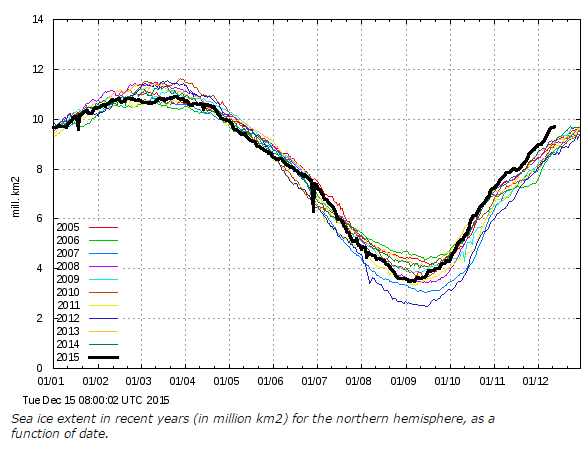
Arctic sea ice growth has been unprecedented this autumn, and extent is far above every other year since at least 2004. This graph from the Danish Meteorological Institute is the best sea ice extent source for doing comparisons – because it uses more meaningful 30% concentration ice rather than the 15% ice used in other commonly cited graphs. DMI specifically recommends that you use this graph for comparisons with other years.
Alarmists constantly attack this graph, because they aren’t intelligent enough to read and comprehend the simple explanation DMI provides.

Data speaks for itself:
http://meteomodel.pl/klimat/arcticice.png
http://meteomodel.pl/klimat/arcticice_nsidc.png
http://meteomodel.pl/klimat/Sea_Ice_Extent.png
I am stunned by the stupidity of this comment, indicating that you didn’t bother to read the post you are responding to.
We should have a graph for ” cfgjd ” extent of stupidity ; but it would “Max” off the scale!
https://www.youtube.com/watch?v=4xgx4k83zzc
Would you like to comment the graphs I posted?
I did – in the blog post above – which you failed to read.
You mean this one…
http://postimg.org/image/7hr785okv/
try again
http://s19.postimg.org/3ldvc63lf/dmiedc14.jpg
Would you care to comment ion this graph?
Do you even know what it means.. or is ignorance you only mode of thinking ?????
http://s19.postimg.org/eteoqkhpv/Amomeandmi.jpg
Arctic sea ice is actually at very high levels for the phase of the AMO.
And much, much higher than almost all of the first 3/4 of the Holocene, when an ice-free Arctic was the norm.
Ignore that facts
its what you do.
Its all that you have.
cfgjd,
this is what you missed:
“This graph from the Danish Meteorological Institute is the best sea ice extent source for doing comparisons – because it uses more meaningful 30% concentration ice rather than the 15% ice used in other commonly cited graphs.”
sunsettommy
i don’t think he “missed it”. He just ignored it because it does not agree with what he wants to believe.
cfool has already demonstrated that he can’t read a graph when I asked him to do simple calculations based on a graph that HE POSTED.
If you post a graph then you should be prepared to demonstrate that you understand what the data in the graph means.
So be assured that he will NEVER post any analysis or display any interest in understanding anything beyond his AGW fundamentalist rantings. It’s like arguing religion with the Jehovah’s Witnesses if you let them in the door. They may be sincere, but they’re not there to have any meaningful discussion beyond proselytization. Start taking St. Augustine or Thomas Aquinas with them and you’ll see that they are only interested in spreading their own message.
Hmmm, the AMO appears immune to CO2 poisoning. I wonder when a government paid “scientist” will remove or adjust the Wikipedia AMO page:
https://en.wikipedia.org/wiki/Atlantic_multidecadal_oscillation
“Would you like to comment the graphs I posted?”
The main message that comes through loud and clear regardless of the metric you use is that the Arctic sea ice has NOT disappeared during the NH summer as so many of the warmists predicted just 8 years ago.
https://www.youtube.com/watch?v=LQCU36pkH7c
stevengoddard
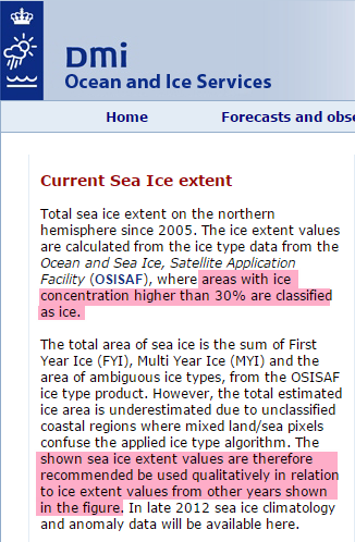
You should heed your own advice and read the DMI explanation more carefully. It says “the total estimated ice area is underestimated due to unclassified coastal regions where mixed land/sea pixels confuse the applied ice type algorithm. The shown sea ice extent values are therefore recommended be used qualitatively in relation to ice extent values from other years shown in the figure”. They are not recommending you use this graph over others, they are saying, if you must use this data (which we know is wrong), you should only make QUALITATIVE comparisons (i.e. not quantitative) . You can’t properly compare these values among years – because they are wrong.
More importantly, DMI has updated their algorithms, and now produce this graph:
http://ocean.dmi.dk/arctic/icecover.uk.php
And they explicitly say (in bold red writing, so there should be no confusion!):
“The plot above replaces an earlier sea ice extent plot, that was based on data with the coastal zones masked out. This coastal mask implied that the previous sea ice extent estimates were underestimated. The new plot displays absolute sea ice extent estimates. The old plot can still be viewed here for a while.”
So you are using an old plot that DMI has replaced with better data. They never said 30% concentration was a better measure than 15% concentration, and they have explicitly replaced the graph you showed with an updated version that doesn’t have the masking problems. What was that about not being “intelligent enough to read and comprehend the simple explanation DMI provides.”?
The DMI page says “The shown sea ice extent values are therefore recommended be used qualitatively in relation to ice extent values from other years shown in the figure.”
Try using your brain
T.H. says ,,,”Alarmists constantly attack this graph, because they aren’t intelligent enough to read and comprehend the simple explanation DMI provides.”
==============================================================
cfgjd, you stepped right in to that one. ” A foolish consistency is the hob-goblin of small minds.”
On the other hand, there is a surplus of such Progressive minds and cfgjd will never feel lonesome.
This dishonest hack and a proven liar left a long trail on this blog:
You really are profoundly stupid, aren’t you?
Do you EVER bother to read the posts you frantically attack, making a total fool of yourself?
Seek professional psychiatric assistance – urgently.
Going on everything I’ve read in recent weeks ; I would not be surprised to see an Ice extent maxima of 12 mil.km2 by March 2016… of course, the warmists will go cold on this outcome…
“DMI specifically recommends that you use this graph for comparisons with other years.”
Yet the DMI still imply that they are eventually going to withdraw the “old” 30% map.
“The old plot can still be viewed here for a while.”
Contradictory to say the least.
Why did they mask coastal zones?
False ice concentrations are reported due to weather and land contamination.
http://polar.ncep.noaa.gov/seaice/support/ssmi.about.shtml
Two different graphs but also different time periods. Confusing!
10 Year record sea ice (2005-15) with the shoreline masked out. OK.
Low sea ice area (1970-2015) with the shoreline. OK
Why not talk the same language?
Your 1970-2015 claim is complete BS. They specifically leave out 1970-1978 because ice extent was much lower.
Steven has been using the DMI 30% ice extent graph rather than the 15% graph for years. It’s a valid metric and he’s stuck with it for years.
I initially had questions about what 15% vs 30% ice extent means. Steve and others explained the methodologies used to create the graphs and satisfied me as to the validity of using the 30% map because it’s a better comparative measure of total ice volume and it’s less vulnerable to the vagaries of the 15% map.
oppti, did you miss the date range in the upper left corner of the DMI graph? Mean Value 1979-2000?
https://coloradowellington.files.wordpress.com/2015/12/dmi-icecover_current_new-201512150812utc.png
On the graph CW has posted..
1. Where did this 1979-2000 mean come from.. they only started doing measurements this way a few years ago
2. The Arctic coastline is a mass of fjords, shallows etc etc and discerning what is actually sea ice and what is land ice is very error prone. The graph SG has been using for ages does not have this problem.
3. Even if the mean is correct, and the values are somehow accurate, look at the current position on the AMO relative to that “mean” period. You can see that the sea ice is doing just ok.
http://s19.postimg.org/eteoqkhpv/Amomeandmi.jpg
I’ve had some of the same thoughts, Andy. Concerning the plotted 1979-2000 mean, I assume they analyzed the OSISAF data with a different mask but I am always dubious about the validity of such historical analyses *). For a taste, look at the 2001-2015 log here:
http://osisaf.met.no/news
It must be daunting to go back and deal with all the metadata variations, changes and conditions, and the exceptions, breakdowns and gaps in the actual data.
Also, to your point #2 about coastal ice measurement:
Let’s put aside for a moment any questions about the veracity of the historical mean and assume it is OK for the time period. The conclusion then from the comparison of the ice extent with and without coastal ice is that we have on one side dramatically more open water ice when compared to the running decade but on the other side so much “missing” coastal ice that the total extent drops to average. I think that is a noteworthy implication that should prompt the ice data jockeys to re-examine their methodology and try to figure out why they are getting such a curious result **).
——————————
*) Beyond Steve’s point about the missing 1970-1978 period
**) It may have been Isaac Asimov who said that most scientific discoveries are accompanied by a mumbling “Hmm, that’s odd …” rather than excited cries of “Eureka”.
Found this link to image in a “to be sorted” folder.. SG might know what its from.
https://stevengoddard.files.wordpress.com/2014/02/screenhunter_306-feb-22-10-26.gif
AMO seems to be a strong sea ice control.
I TOLD YOU
all my results are showing we are cooling from the top latitudes downward
– it has to do with composition of chemicals TOA
as stipulated by what happens on the sun.
When looking at temps.
all data sets look at average temps.
which is dumb, because, for various reasons, ave temps. don’t tell you much
better is to look at maxima (a measure of energy coming in)
http://oi60.tinypic.com/2d7ja79.jpg
or minima (a measure of energy going out)
https://i0.wp.com/oi62.tinypic.com/33kd6k2.jpg
if you can get the relevant data
note that in the case of the last graph [for minima]
the weather stations NH and SH were balanced to zero latitude
[I found it a common mistake that data sets are biased toward NH stations]
Longitude does not matter, as long as you look at the rate of change per annum.
If you don’t get that, ask me….
There seem to be two separate sources of confusion with DMI’s products.
First, from the image of the page of text in the OP:
I take that to mean that this is rather old text.
The other thing is from http://ocean.dmi.dk/arctic/icecover.uk.php which shows recent data that is unremarkable compared to previous years:
http://ocean.dmi.dk/arctic/plots/icecover/icecover_current_new.png
It mentions in red text at the bottom:
I think this text is much more recent than the OP’s image. The reference to the “earlier sea ice extent plot” is the plot showing the remarkable recovery. I think DMI is saying not to rely on that one.
It looks like the image I posted is showing an ancient, cached version from the end of October. This link may not display, but following it should show the new one. (Or just go to the DMI page I linked to.)
http://ocean.dmi.dk/arctic/plots/icecover/icecover_current_new.png?foo.png
Rick, we’ve experienced some version caching peculiarities before and I remember looking into it. If you want to show a specific dated version of the graph you have to save it and link to the saved copy.
I know that WordPress caches images and it’s possible that DMI is doing some server juggling when they are updating.
Some background here:
https://stevengoddard.wordpress.com/2015/10/04/arctic-gained-20000-manhattans-of-ice-in-september/#comment-544695
BTW, how did you get the “foo” version of the DMI URL?
“http://ocean.dmi.dk/arctic/plots/icecover/icecover_current_new.png?foo.png”
I typed in the “?foo.png” manually. My hope was that by providing a different URL, I’d bypass any caching that WP is doing, but I wanted the URL to end in .png because WP matches on the last component of a URL to decide if it’s an image to display inline, or a web page that it should link to instead.
The question mark introduces any parameters to pass to the web page (typically CGI script in that case), and web servers generally ignore those for image URLs, so my addition wouldn’t interfere with what DMI would return.
At any rate, clicking on either image seems to take people to the recent image at DMI.
Thanks, Ric. I thought it was an attempt to beat the cache. BTW, sorry for the misspelling that got away from me. I usually read what I type and catch typos.
Rick, there has been a lot of comments on previous posts about why Tony uses the 30% sea ice figures from DMI with coastal areas masked rather than the 15% graph with coastal areas unmasked.
The two graphs show different things.
Sorry Ric, auto correct got me.
Yeah, I read through https://stevengoddard.wordpress.com/2015/11/07/record-arctic-ice-growth-continues/ . I posted from work just before leaving and didn’t want to dig into too much of the history here (I generally hang out at WUWT). I probably wouldn’t have posted if I had read that. It would be nice if Steven would mention which graph he’s referring to at the time, especially because it leaks into FaceBook and other places.
I might write DMI and ask for explanations and analysis. Has anyone done that?
Tony explains it in the post Ric, its about sea ice. Do you remember at school doing cloud cover excercises how little cloud was needed for 1/8th?
No problem misspelling my name, especially in these #%&@ days of clueless autocorrect. Thank you (and CW) for noticing.
I’m not a meteorologist, so I never did cloud cover exercises, but understand the sources of confusion in “determining” cloud cover (I’m reluctant to call it “measuring”). I have considered using a solar sensor to measure the percentage of time it’s shaded by clouds. I’d expect to become completely disillusioned with the quality of any cloud cover measurement in the entire collection. Well, except 0% and 100% cover. It’s hard to screw them up.
I imagine that a direct measure of shade time may not be an acceptable measurement per NOAA and WMO since they need compatibility over the whole record….
Hi Ric
I wrote to DMI to ask why their 2 graphs differed so much but did not get a reply. I wrote when the divergence was not as great as it is now. It’s unusual, even with different percentages of ice and algorithms used that one graph should show so much of a difference to a herd ( flock) of others.
I’m not sure why Steve G states “This graph from the Danish Meteorological Institute is the best sea ice extent source for doing comparisons – because it uses more meaningful 30% concentration ice rather than the 15% ice used in other commonly cited graphs. ”
Why is it more meaningful ? Would 60% be even more so? As long as it is consistent over years I don’t see a problem with 15 or 30.
Andy
Don’t forget one graph counts the ice at the margin of the shoreline, and one doesn’t because there are issues with counting that.
There’s more than that though involving the extent. Perhaps storminess has been low, I’d expect that to keep ice close together, which would allow for a bigger 30% count, and allow it to get closer to the 15% count.
Ric, you can’t compare the two graphs at all…and that’s sorta the whole point of DMI doing it….
One is 15% with the coast line…
….the other is 30% without
they have nothing in common
Reblogged this on Canadian Climate Guy.
Reblogged this on Climatism.
Ric, Yes I know that one doesn’t count shoreline, however at this point of the year most of the ice has reached shoreline, so the values for both graphs will be not changing, one will just be smaller than the other as the shoreline part is not measured. So what is being measured is the parts which are still expanding, mainly into the Atlantic and now Pacific. Here shoreline effect does not have as much of an influence, so why is the one with shorelines masked out increasing at a bigger rate than the ones without ?
It’s not the difference in values I am questioning, just why the change now in relative values?
It will be interesting to see how this pans out. At least a good topic for discussion.
Andy
Andy, it’s a percentage of what is measured, having one measure the shore and the other not, will not change the percentage of what is measured…
It’s like comparing cherries with apples ; we know what the Warmists choose to pick..!
Similarly, I don’t think it is possible to compare temperature recordings from today with those taken 50 or even a 100 years ago. Everything changed in the early seventies when they started with thermo couples and computers.
To eliminate differences in recording by weather stations, I recommend looking at the rates of change over time. Maxima and minima also give better results
https://stevengoddard.wordpress.com/2015/12/15/arctic-sea-ice-growth-continues-to-blow-away-all-records/#comment-558817
To get an idea of what is going on now at both our poles, don’t we have a weather station that we can trust recording the increasing cold?
As they are using the same algorithm its more like comparing a large banana to a smaller banana. It’s still bananas though that graph…….
Ok, terrible joke … and I’m laughing at it still. Bad form….
Andy