
arctic.atmos.uiuc.edu/cryosphere/timeseries.global.anom.1979-2008
Since this date in 2005, the amount of sea ice on Earth has grown by about the area of California and France combined. In a few days it will likely be back above the 30 year mean.
arctic.atmos.uiuc.edu/cryosphere/timeseries.global.anom.1979-2008
Since this date in 2005, the amount of sea ice on Earth has grown by about the area of California and France combined. In a few days it will likely be back above the 30 year mean.

France and California combined. Interesting thought, especially lately. Wouldn’t they just surrender and throw away their guns, after refusing to take a shower?
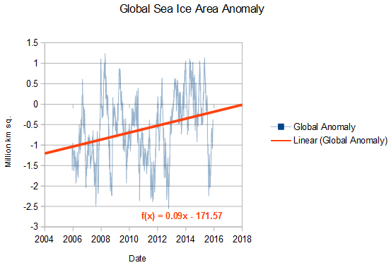
http://arctic.atmos.uiuc.edu/cryosphere/IMAGES/global.daily.ice.area.withtrend.jpg
Wrong graph. Tony was discussing 2005 to present. Why do you guys always cherrypick 1979? Is that when the IPCC created the heavens and the Earth?
actually gat, I like that graph..
The high in 1979 was 22, the low 20…..exactly what it says for right now
Yep, it shows just how incredibly little variability there is in global sea ice.
Also shows, like basically every other indicator except biosphere growth,…
… just how little effect a slight gain in atmospheric CO2 has on anything.
Steven, why select 2004? You always choose 1998 for temperature, but for global sea ice you choose 2004. Why is that? You are claiming something happened in 1998 or before to change the upward trend in global average temperature to stop. What was that event? And now you are claiming something happened in 2004 or before to stop the downward trend in global sea ice area? What was that event? I think you have to propose two significant causes there.
For the record, here is the actual trend in global sea ice extent. Yes, it’s still down: https://www.ncdc.noaa.gov/snow-and-ice/extent/sea-ice/G/0
Marty, why select 1979? You always choose 1979 as if it is the alpha and the omega. Why is that? You are claiming that 1979 is the dawn of Arcic ice? Are you that stupid? And now you are using 1979 to show a downward trend in global sea ice area. Why is that? I think you have to come to the realization that 1979 is a major cherrypick.
The graph starts in December 2005, 10 years ago (a decade) as I specified in the text.
Reading is hard for Martin.
Steven, that doesn’t answer the question. Why start a decade ago? You always start your pause graph in 1998 or 1997. Your claim is that something happened then to change the trend. Change point analysis shows there was no change in trend at that time, but you are claiming the trend changed. What climate or geophysical event happened to cause the trend to change? You have to answer that. At least propose some explanation.
And now you are saying the same thing about sea ice in December 2005. What happened before that time to cause the sea ice trend to change from down to up? You are claiming some event happened then. What was it?
You haven’t read or learnt a single thing in your whole time here.
Even you can’t be that dumb and ignorant.. or can you? It must be an act. !!
One last try.. although I know you are a hopeless case.
here is the NH ice (in green) flipped and super-imposed on the AMO.
http://s19.postimg.org/4crolmgmr/amo_vs_NHice.jpg
Maybe if can actually engage your brain for once , you will start to understand.. as if !!
As soon as you look at the AMO it becomes immediately obvious why they MUST choose 1979 as the starting point.
It is the ULTIMATE propaganda cherry-pick.
http://s19.postimg.org/7c5hbcs6r/amomean.jpg
Even the Swiss glaciers are heavily affected by the AMO.
http://oi51.tinypic.com/24yptu0.jpg
No wonder the alarmista are getting so, so panicky…
… even the dumbest ones can see that the AMO is now heading downwards.
Martin-
No. Tony isn’t claiming any event caused anything. He’s claiming that currently, the decadal trend is opposite to what’s generally reported in the media. Others here, particularly Andy, are suggesting a cause. Tony is only reporting the measurements.
Since you’re the one claiming that every variation prior to roughly WWII is well understood, with the causes all known and quantified, perhaps you could give us a hint as to what’s caused this decade long departure from the projections? Is one of those fully understood natural variations behind it? Or has CO2 reached a tipping point, and started causing an increase in sea ice? The models you espouse are projecting changes in the direction opposite to those being measured. What is being done to address the divergence of the models from the data?
You can choose 1979 if you want. Then the text would read “No change in sea ice in the past 3.6 decades”
Martin chooses 1979 because it was the very base point of the AMO.
Even Martin knows by now that the whole NH sea ice and in fact a lot of land ice is heavily effected by the AMO.
He also knows that the AMO has now levelled of and started to turned, and that is why NH ice is on the increase.
He won’t tell you any of this, because he is embarrassed to admit to his prior ignorance.
Martin, that is the wrong graph.
1.. 2004 is where the AMO levels off.. It shows start of the turning point. The sea ice is behaving exactly as the AMO would indicate. ie starting to increase.
1. The 1998 chooses itself mathematically (actually, in RSS its 1997.1).
Your mathematical ineptitude hasn’t allowed you to figure that out yet.
The very slight trend in global sea ice is driven entirely by the NH sea ice which is mainly driven by the AMO….
….and as SG has illustrated, NH sea ice is starting to climb again because the AMO has turned.
And let’s not forget our old friend – the DMI Sea Ice Extent Plot! 🙂
Merry Christmas!
http://ocean.dmi.dk/arctic/plots/icecover/icecover_current.png
The DMI graphs are notorious for back-dating themselves.
Here is the correct date.. Look at that sea ice climb.. !!!
http://s19.postimg.org/kw649or03/dmi_Dec10.jpg
. They haggle over the dates as if that is important when the fact is that it does not matter. Arctic ice and in fact the ice at neither pole is supposed to be growing according to the AGW hypothesis and it is. So they have to change their objections in order to ignore that simple fact. It is the same display of cognitive diarrhea one runs up against so often when arguing with a leftist on any subject. When argument or premise is destroyed by the facts presented they ignore that fact and go on to something else as if it never happened.
the cfg graph above is perfect it shows global ice has been complete normal for the past 5 years. whats the problem
Hi all.. first post on the site, been reading the excellent articles and comments here on here for a while now. No qualifications or backround in science / climatology so forgive me If I come out with some basics in future posts
If anyone has not already seen it here is a link to the Heartland, CFACT and CEI conference in Paris a few days ago
https://www.youtube.com/watch?v=uZKIUP9EGp8
Also link to Ted Cruz climate science hearing (not watched that one yet)
https://www.youtube.com/watch?v=5KVTmo2Vxnk
Excerpt:
2005.9260 -0.8182586 19.1366730 19.9549313
2015.9260 -0.4361824 19.5187492 19.9549313
It wasn’t immediately obvious to me what those figures represent, but I think I’ve deduced that:
The first column is the date, expressed as a decimal fraction of a year (at midnight).
The third column is the sea ice extent measured on (or interpolated to) that date.
The fourth column is the average global sea ice extent for that day-of-the-year, 1979-present (or perhaps over some particular range of years).
The second column is the “anomaly” — the 4th column minus the 3rd column
Does that sound about right?
I heard from Al Gore the ice was going to be almost gone by now. Why would a politician lie about something like this?
Because he’s a politician with an agenda. Your question should be, “Why would he tell the truth about ….”. That’s assuming you do actually catch him telling the truth about something.
Here the Arctic sea ice is at 2011 and 2012 levels.
http://osisaf.met.no/quicklooks/sie_graphs_new/osisaf_nh_iceextent_daily_5years.png
It’s comparing oranges with lemons, they are not the same but similar Don. The graph you show is 15% + sea ice with coastal areas unmasked. The Graph Tony is referencing, which, he has been doing for ever BTW is 30% sea ice with coastal areas masked.
It is the difference between total ice and heavy sea ice.
Sorry, I meant Andy, not Tony.
The coast areas around the Arctic are a mass of fjords and coastal shelves etc.
sea ice in this area has been , and still is, difficult to determine accurately with satellites.
If you compare the daily values you will see that the difference can be anywhere up to about 2 million km². This coastal region carries a much higher error margin than the “coasts masked out” version that SG has used since 2005.
SG uses the graph he does for reasons of longer term data and better consistency.
The 4 year error-prone “new” version might start being useful in about 5-10 years.
Thickness of ice sheets 21,000 years ago compared to modern skylines
Toronto, Chicago, Boston and Montreal
http://strangesounds.org/wp-content/uploads/2013/06/k-bigpic.jpg
Greenies want to return to the ice age. They hate modern warming. It’s been warming for 20,000 years now. How long of a time period do we need for our graphs to reveal the level of foolishness?
They believe that by strangling economies around the world and keeping the poor impoverished they can stop the oceans from rising. Just like King Cnut.
I remember of a recent history when a group of people were told the trains they were getting on were going to a nice, warm camp where they’d be well taken care of. They call us deniers, when they are trying to create a new global holocaust?
Yes, but please: Cnut the Great did no such thing!
He was making a point to his idiot courtiers that he did not have the power to stop the oceans from rising!
I wish our self-anointed princelings and their idiot courtiers had a fraction of the wisdom and humility of the great king Cnut.
https://en.wikipedia.org/wiki/King_Canute_and_the_waves#/media/File:Canute_rebukes_his_courtiers.png
https://coloradowellington.files.wordpress.com/2015/12/king-canute-rebukes-his-courtiers.png
Yes, thank you!
Piomas is also climbing, since 2010 , anyway.
http://psc.apl.uw.edu/wordpress/wp-content/uploads/schweiger/ice_volume/BPIOMASIceVolumeAnomalyCurrentV2.1.png
And before the little brain-dead trolls comment on the small climb in Piomas from 1982 -1984, I suggest they see what the AMO did during that short period.
Hey.. Nice correlations.. and with good reason (source SunshineHours)
https://sunshinehours.files.wordpress.com/2015/12/curry_christy_co2_level_global_grain.jpg