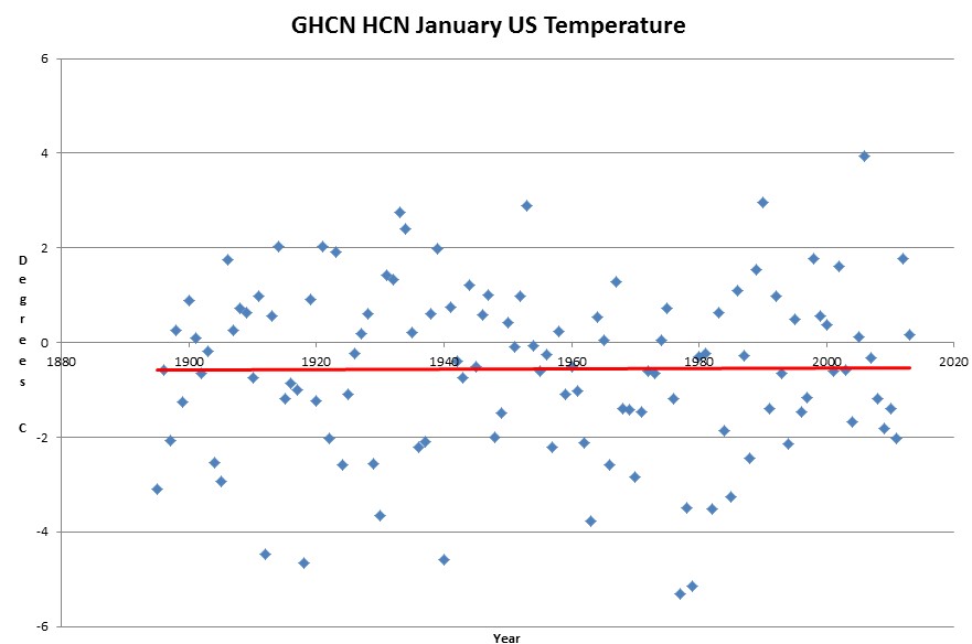
East coast lunatics believe that winter is a thing of the past, but the US shows no trend in January temperature since 1895.
I beg to differ, there is clearly a trend of blue dots on either side of a red line. Panic.
High anxiety. Ban blue dots!
http://tamino.wordpress.com/2013/01/16/he-knows-not-what-hes-doing/— what do you think??
Looks like we are going thru a period of unprecedented climate stability!
Yes, quick! … someone needs to shake this up!
http://www.bom.gov.au/ntc/IDO60202/IDO60202.2005.pdf
Attached is a link to a Australian report on tidal fluctuations covering 1990 to 2005.
Page 25 shows monthly change in SL to be zero over the period.
http://www.bom.gov.au/ntc/IDO60202/IDO60202.2011.pdf
This is the latest 2011 Australian Sea Level Report. Page 23 has the SL charts.
It looks to me to be a nice cyclical record of gradual rise and fall over decades. 2010 and 2011 had big La Nina’s effecting Australia which effected annual Sea Levels.
Your email address will not be published. Required fields are marked *
Comment *
Name *
Email *
Website
Save my name, email, and website in this browser for the next time I comment.


I beg to differ, there is clearly a trend of blue dots on either side of a red line. Panic.
High anxiety. Ban blue dots!
http://tamino.wordpress.com/2013/01/16/he-knows-not-what-hes-doing/— what do you think??
Looks like we are going thru a period of unprecedented climate stability!
Yes, quick! … someone needs to shake this up!
http://www.bom.gov.au/ntc/IDO60202/IDO60202.2005.pdf
Attached is a link to a Australian report on tidal fluctuations covering 1990 to 2005.
Page 25 shows monthly change in SL to be zero over the period.
http://www.bom.gov.au/ntc/IDO60202/IDO60202.2011.pdf
This is the latest 2011 Australian Sea Level Report.
Page 23 has the SL charts.
It looks to me to be a nice cyclical record of gradual rise and fall over decades. 2010 and 2011 had big La Nina’s effecting Australia which effected annual Sea Levels.