
The frequency of 100 degree days in the US peaked just below 310 PPM CO2, and has been declining as CO2 has increased. There is absolutely no correlation between hot weather and increasing CO2.
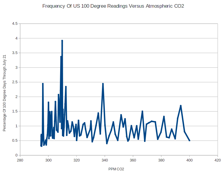
The frequency of 100 degree days in the US peaked just below 310 PPM CO2, and has been declining as CO2 has increased. There is absolutely no correlation between hot weather and increasing CO2.

Not disputing but global numbers are where the argument has to be made, IMHO. And those numbers look good too.
There aren’t any accurate global numbers from the 1930s. The US data is by far the best in the world.
So where do the “global numbers come from? Mainly from the USA!
Data records by latitude: http://i34.tinypic.com/2naty6c.png
Back in 2010 E.M. Smith, Verity Jones and Kevin in the UK looked at The ‘Station drop out’ problem Thise article has graphs showing where the remaining data stations are located after the Climastrologists dropped a lot of stations to artificially increase the temperature
Pay close attention to this graph showing most records are from North and Central America especially after around 1990 link
And then look at the breakdown of Raw data stations – North and Central America:
link
Those graphics show that MOST of the Raw data stations are in the USA!
So Steve is really not off base looking at what is happening in the USA since that is where the majority of the data comes from.
“Pay close attention to this graph”…
I love it.
Even more so that the “Warmists” will NEVER get it. They live to die for AGW. Not rational.
Steve,
See if you can get this raw data. Observations by the same person for 84 years!
http://wattsupwiththat.com/2014/07/23/i-wonder-how-this-dedicated-weather-observer-feels-about-having-his-readings-adjusted-by-ncdc/